

A micro landing page is defined as a compact web page with minimal content, built to drive one specific conversion action such as a registration, download, or purchase. Unlike full landing pages loaded with sections and supporting content, a micro landing page strips everything down to the essentials. The result is a fast, focused experience that removes decision friction and points visitors toward a single goal. Digital marketers use them across paid ads, email campaigns, and social media to capture intent at its peak. This guide covers the micro landing page definition, its key components, when to use one, and how to build pages that actually convert.
What is a micro landing page, and how does it work?
A micro landing page is a small landing page with minimal content designed to promote one specific offer or action. It functions as a compact version of a standard landing page, with a single conversion goal and very few content blocks. The page loads fast, presents one clear message, and asks visitors to take one action.
The concept is not new, but its application has sharpened considerably as paid traffic costs have risen. When you pay for a click, you want that click to land somewhere with no exits, no competing offers, and no distractions. A micro landing page delivers exactly that. Every element on the page exists to support the one action you want the visitor to take.

Common use cases include advertising campaigns, lead generation, single product promotions, limited-time offers, and A/B testing for marketing hypothesis validation. Their simplicity makes them fast to build and easy to iterate. That speed is a real competitive advantage when you are running multiple campaigns simultaneously.
How does a micro landing page differ from standard pages and microsites?
The confusion between micro landing pages, standard landing pages, and microsites is common. Each serves a different purpose, and choosing the wrong format costs conversions.
A standard landing page is single-page and conversion-focused with one main CTA and minimal distractions, but it typically includes more content blocks than a micro version. It might feature testimonials, a feature list, an FAQ section, and a longer value proposition. A micro landing page cuts all of that down to the bare minimum required to convert a visitor who already has intent.
A microsite is a different animal entirely. Microsites are multi-page, exploration-oriented mini websites with richer content. They work for brand storytelling, product launches with complex narratives, or campaigns where the visitor needs to explore before committing. If the next user action is simple and direct, a landing page format wins. If exploration is needed, a microsite is the better fit.
The table below maps the key structural differences.
| Feature | Micro landing page | Standard landing page | Microsite |
|---|---|---|---|
| Page count | Single page | Single page | Multiple pages |
| Content depth | Minimal | Moderate to detailed | Rich and narrative |
| Navigation | None | None or minimal | Yes, internal links |
| CTA complexity | One simple action | One primary CTA | Multiple CTAs across pages |
| Best use case | Paid ads, quick offers | Lead gen, product detail | Brand campaigns, exploration |
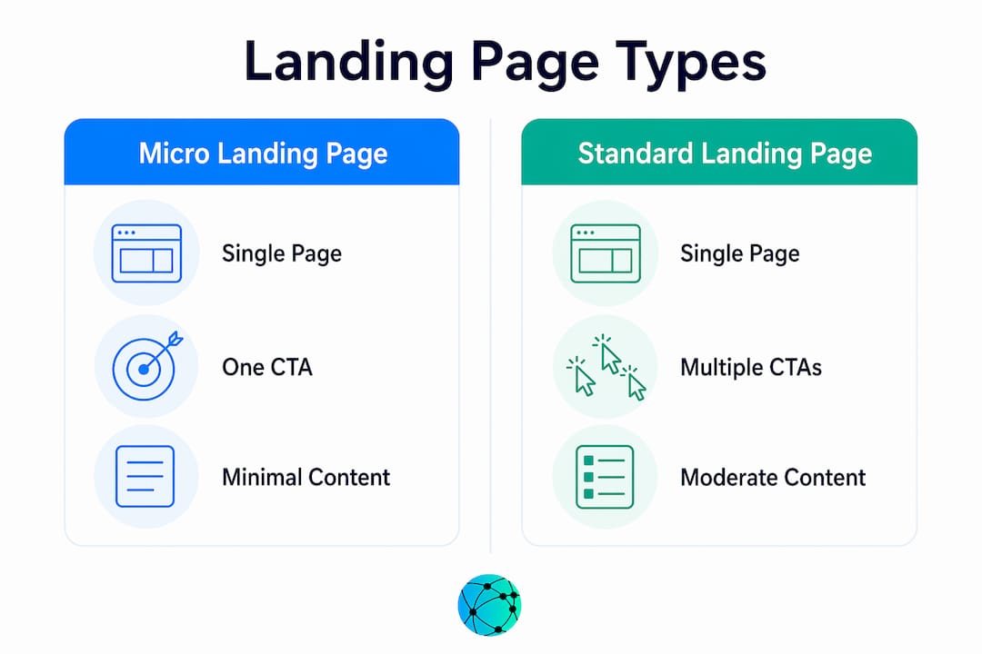
Confusing micro landing pages with microsites causes scope errors that derail campaigns. Knowing which format matches your user's intent is the single most important decision before you build.
What are the essential components of an effective micro landing page?
Every effective micro landing page shares the same core structure. The key components are a short headline with a clear value proposition, a brief offer description, one visual element such as an image or short video, and a single CTA button or form. Some pages add one or two supporting benefit statements, but nothing more.
Here is what each element does in practice:
- Headline: States the offer and the benefit in one line. "Get your free 7-day trial" beats "Welcome to our platform" every time.
- Value proposition: One sentence that answers "why should I care?" Place it directly under the headline.
- Visual element: A product image, a short micro video, or a simple graphic. Visuals increase comprehension speed and emotional engagement.
- CTA button or form: The single most important element on the page. The button label should match the offer exactly. "Start my free trial" outperforms "Submit."
- Supporting benefits: Optional. Use two or three bullet points only if the offer needs brief context to overcome hesitation.
Pro Tip: Keep your CTA above the fold on mobile. Most micro landing page traffic arrives from paid social, where users scroll fast and bounce faster. If your button requires scrolling, you lose a measurable share of conversions.
The goal is minimalism with enough context to convert. Stripping a page too bare leaves visitors without the information they need to act. Adding too much turns a micro landing page into a standard one.
When and why should marketers use micro landing pages in campaigns?
Micro landing pages work best when visitors arrive with a clear intent from paid ads, email, or deep links. The simple, direct conversion path suits audiences who already know what they want. If user intent is unclear, a longer page or microsite with more narrative context serves better.
The strongest use cases for micro landing pages are:
- Paid advertising campaigns. A visitor who clicks a Facebook or Google ad has already expressed intent. Send them to a page that mirrors the ad message and asks for one action.
- Lead generation. A single form asking for a name and email converts better than a page that also asks for a phone number, company size, and job title.
- Limited-time offers. Urgency works best when the page is clean. A countdown timer and one CTA button create pressure without confusion.
- Event registrations. One date, one location, one "Register now" button. No sidebars, no related events, no distractions.
- A/B testing. Micro landing pages are efficient experimental surfaces because their compact layout lets you test a single variable, such as a headline or button color, without reworking a large page.
- Hyperlocal marketing. Geography-specific pages match local search intent with focused conversion goals, improving relevance and results for location-based campaigns.
The benefits stack up quickly. Micro landing pages load faster than full pages, present fewer distractions, and are built for mobile from the start. For campaigns running on tight budgets where every click counts, that combination is hard to beat.
How to create and optimize a micro landing page for maximum conversion
Building a micro landing page is fast by design. The challenge is not the build. It is the discipline to keep it minimal when the instinct is to add more.
Follow these steps to build and refine a page that converts:
- Start with one clear message. Write your headline first. If you cannot state the offer in one line, the offer is not clear enough yet.
- Limit page blocks. A hero section, a brief description, and a CTA button is a complete page. Add a block only when data shows visitors are dropping off because they lack information.
- Align the CTA with the campaign. The button label should echo the ad or email that sent the visitor there. Consistency between ad copy and landing page copy reduces bounce rates.
- Launch fast, then test. Micro landing pages are designed for speed. Get a version live, then run A/B tests on the headline and CTA. Do not wait for a perfect page before launching.
- Avoid multiple CTAs. A single CTA alignment with the campaign message is the most reliable way to maintain conversion focus. Two CTAs split attention and reduce results.
- Check your CTA copy. Read the guide on effective CTA links to understand what language drives clicks versus what language stalls them.
Pro Tip: Standardize your page components into a reusable template: hero section, value proposition, visual, and CTA. Swapping offers into a fixed structure cuts build time and keeps your pages consistent across campaigns.
The validation approach that works is to start minimal and add proof points only when data shows visitors are dropping off because they lack information. Assumptions about what visitors need lead to bloated pages. Data tells you what they actually need.
Key Takeaways
A micro landing page converts best when it carries one message, one visual, and one CTA aligned with the traffic source that sent the visitor there.
| Point | Details |
|---|---|
| Core definition | A micro landing page is a minimal, single-goal page built to drive one specific conversion action. |
| Structural difference | Micro landing pages have fewer blocks and no navigation compared to standard pages or microsites. |
| Best traffic sources | Paid ads, email, and deep links work best because visitors arrive with clear intent. |
| Essential components | Headline, value proposition, one visual, and a single CTA button or form are the required elements. |
| Optimization approach | Launch minimal, then add content only when drop-off data shows visitors need more information. |
Why I think most marketers overcomplicate this
The most common mistake I see is treating a micro landing page like a shortened version of a full landing page. Marketers cut the testimonials section and the FAQ, then call it done. The page still has three CTAs, a navigation bar, and a footer full of links. That is not a micro landing page. That is a cluttered page with less content.
The real discipline is removing everything that does not directly support the one action you want. That means no navigation, no secondary offers, and no "you might also like" sections. When I have worked with campaigns that made this shift, the improvement in conversion focus was immediate and measurable.
The other mistake is using micro landing pages for cold traffic. A visitor who has never heard of your brand and arrives on a page with four lines of text and a button will not convert. Micro landing pages are built for warm audiences. Pair them with bio link pages for social traffic, or use them as the destination for retargeting ads where the visitor already knows the offer.
Scale comes from standardizing your components. Build one solid template with a fixed hero section, value proposition slot, visual placeholder, and CTA block. Swap the offer in and out. That approach lets you run ten campaigns without building ten pages from scratch. Speed and consistency compound over time.
— Axion
Lflow makes building focused link pages fast
Digital marketers who understand the power of a focused, single-action page need a platform that matches that thinking. Lflow is built for exactly that.
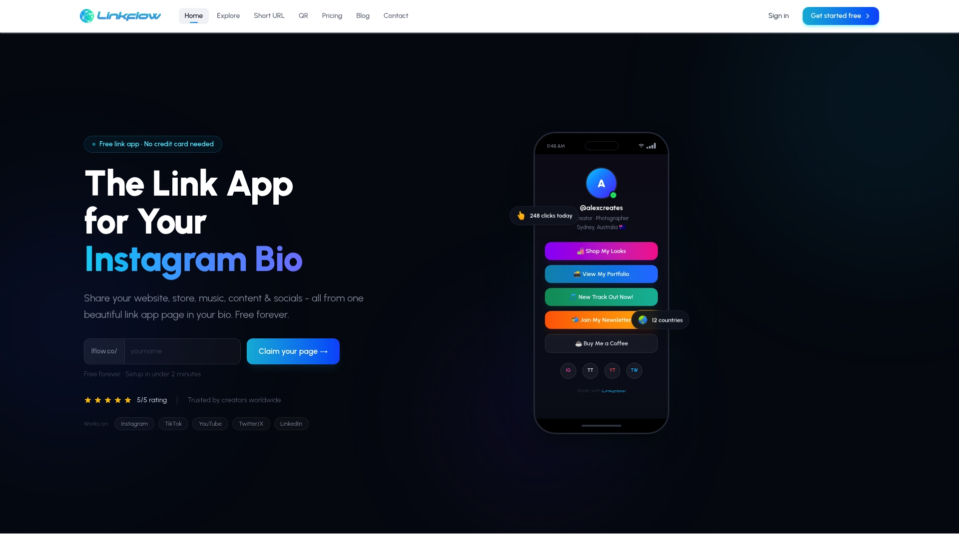
With Lflow, you can create a free link in bio page that acts as a branded micro hub for all your campaigns. Add unlimited links, customize the design with your own colors, fonts, and domain, and track real-time engagement through built-in analytics. Setup takes under two minutes. Lflow also generates free QR codes for offline promotion, making it easy to connect physical and digital campaigns. For creators and marketers who run multiple offers at once, Lflow keeps everything organized in one clean, mobile-optimized page that works across Instagram, TikTok, YouTube, and LinkedIn.
FAQ
What is a micro landing page in simple terms?
A micro landing page is a small web page with minimal content focused on driving one specific action, such as a sign-up, download, or purchase. It removes distractions and guides visitors directly to a single conversion goal.
How is a micro landing page different from a regular landing page?
A micro landing page has fewer content blocks, faster load times, and a single offer, while a regular landing page includes more detail such as testimonials, feature lists, and longer copy. Both use one CTA, but the micro version is stripped to the minimum needed to convert.
When should I use a micro landing page instead of a microsite?
Use a micro landing page when the desired user action is simple and direct, such as registering for an event or claiming an offer. Choose a microsite when visitors need to explore content across multiple pages before making a decision.
What is the biggest mistake marketers make with micro landing pages?
The most common mistake is adding multiple CTAs to a single page. A single CTA reduces cognitive load and keeps the conversion path clear, while multiple CTAs split visitor attention and lower results.
Can micro landing pages work for social media campaigns?
Micro landing pages work well for social media traffic when visitors arrive from a specific ad or post with clear intent. Pairing them with a well-structured bio link page helps direct social audiences to the right offer without confusion.