
A call to action link (CTA link) is a deliberate, clickable element designed to move a user toward one specific outcome, whether that's a purchase, a sign-up, or a content download. Unlike passive hyperlinks, CTA links are engineered with intent: the copy, color, placement, and surrounding context all work together to prompt a decision. Personalized CTAs outperform generic ones by 202%, and urgency-based CTAs can lift conversions by as much as 332%. For content creators and marketers managing social media presence across Instagram, TikTok, and YouTube, understanding call to action mechanics is the difference between an audience that scrolls past and one that converts.
What are call to action links and why do they matter?
Explaining call to action links starts with separating them from ordinary hyperlinks. A standard link connects two pages. A CTA link connects a user's current intent to a desired next step, and every design choice reinforces that connection. The HarvardSites design system, for example, treats CTA links as a distinct component class with specific visual rules, separating them from body text links to signal hierarchy and urgency to the reader.
The importance of call to action links shows up directly in revenue and engagement data. Well-designed CTAs increase conversion rates by up to 161% compared to poorly designed alternatives. That gap exists because most CTA links fail on one of three dimensions: copy that doesn't communicate a benefit, placement that misses the moment of peak intent, or visual design that blends into the page. Elementor's CTA widgets address the design dimension by giving marketers direct control over button style, hover states, and responsive behavior without writing code.

CTA links also function as a contract between the user and the brand. The user clicks because they expect something specific. If the landing page doesn't deliver on that expectation, bounce rates spike and conversion data becomes unreliable. Getting this right is foundational to any social media or content marketing strategy.
What are the common types of CTA links and how do they differ?
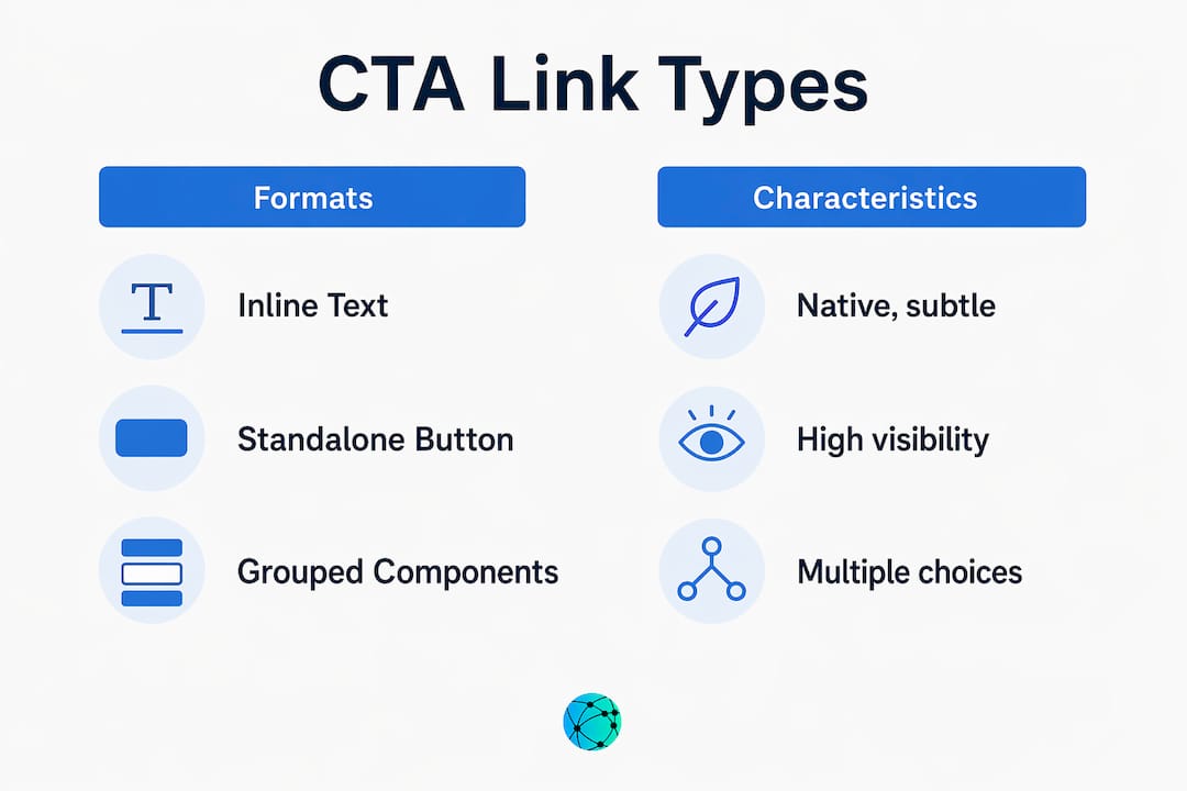
CTA links appear in three primary formats, and each serves a different context.
Inline text links sit inside body copy and convert readers who are already engaged with the content. They feel native and low-pressure, which is why inline CTAs perform 121% better than sidebar CTAs on content-driven websites. The trade-off is visibility: inline links can be missed by scanners who don't read every word.
Standalone buttons are the most recognizable CTA format. They use color contrast, white space, and size to demand attention. The HarvardSites CTA link component specifies distinct button states (default, hover, focus, disabled) to maintain accessibility and visual consistency across devices. Buttons work best when the user has already consumed enough context to make a decision.
Grouped CTA components present two or more options simultaneously, typically a primary action and a secondary one. Think "Start Free Trial" paired with "See How It Works." This format reduces decision paralysis by acknowledging that not every visitor is at the same funnel stage.
| CTA Type | Best Use Case | Key Advantage | Key Risk |
|---|---|---|---|
| Inline text link | Long-form content, blog posts | Feels native, high engagement | Easy to miss for scanners |
| Standalone button | Landing pages, social bios | High visibility, clear intent | Can feel pushy without context |
| Grouped CTA component | Homepage, mid-funnel pages | Serves multiple intent levels | Splits click data, adds complexity |
For social media specifically, standalone buttons and grouped components dominate because feed environments reward visual clarity. Inline links work better in newsletters, LinkedIn articles, and blog content where readers spend more time per page.
How to design effective CTA links: copy, color, and placement
The copy on a CTA button carries more weight than most marketers assign to it. Research recommends 2 to 5 words for button text, with any additional detail placed in supporting microcopy nearby. "Get My Free Report" outperforms "Download" because it communicates ownership and benefit in four words. Words like "Instant," "Free," and "Limited" activate urgency and emotional response without requiring extra space.
Color contrast is not a stylistic preference. It is a functional requirement. A CTA button that blends with the background loses clicks regardless of how strong the copy is. The standard guidance is a 4.5:1 contrast ratio between button color and background, which also satisfies WCAG accessibility requirements. Size matters too: buttons smaller than 44x44 pixels on mobile create friction because they are difficult to tap accurately.
Placement strategy separates average CTA performance from exceptional performance:
- Above the fold: Place a CTA where users see it before scrolling, particularly on landing pages and social bio pages where attention drops sharply after the first screen.
- Inline with high-engagement content: Position CTAs immediately after a key insight, statistic, or story beat, when the reader's interest is at its peak.
- Sticky CTAs on mobile: Sticky buttons on mobile remain visible during scrolling, reducing friction and keeping the conversion path accessible without interrupting the reading experience.
- End of content: Readers who finish an article or video are self-selected high-intent users. A CTA at the end captures this group specifically.
Pro Tip: Test your CTA copy by replacing the verb with the user's first-person perspective. "Start My Free Trial" consistently outperforms "Start Free Trial" because it shifts ownership to the reader before they click.
Effective link placement in social media contexts follows the same logic: put the most important CTA where attention is highest, not where it is most convenient for the layout.
How can CTA links be optimized and tracked for maximum effectiveness?
Most marketers track whether a CTA gets clicks. Fewer track which CTA gets clicks when multiple buttons point to the same URL. This distinction is where significant optimization data gets lost.
Link Aliases solve this problem by assigning a unique label to each CTA link even when the destination URL is identical. In Salesforce Marketing Cloud, for example, a header button and a footer button pointing to the same landing page can each carry a distinct alias, producing separate click-through rate data for each placement. Without aliases, the platform merges all clicks into one number, making it impossible to know which CTA is driving performance.
Here is a practical setup for CTA tracking across a content campaign:
- Define your CTA inventory. List every button, inline link, and icon that points to each destination URL before launch.
- Assign unique aliases. Label each CTA by position and format: "header-button-homepage," "inline-link-paragraph3," "footer-cta-newsletter."
- Align verb messaging. The button text, the surrounding microcopy, and the landing page headline should all use the same core verb. Consistent CTA elements reduce bounce rates by matching user expectation to post-click experience.
- Set up GA4 event tracking. Tag each CTA as a distinct event in Google Analytics 4 so you can filter performance by placement, device, and traffic source.
- Audit accessibility. Custom UI elements, including interactive buttons built outside standard HTML, require manual ARIA labeling and keyboard navigation support to function correctly for all users and to register accurately in tracking tools.
Pro Tip: If you are running paid campaigns, match your CTA button verb to the campaign objective event you are optimizing for. Misaligned button text forces the ad platform's algorithm to reconcile conflicting signals, which extends the learning phase and raises your cost per result.
What are the key differences between platform-specific CTA implementations?
Ad platforms do not give marketers free rein over CTA button text. Each platform offers a structured set of predefined options, and choosing the wrong one for your funnel stage actively hurts campaign performance.
Meta provides 18 or more CTA button options, ranging from "Learn More" (top of funnel) to "Buy Now" and "Book Now" (bottom of funnel). TikTok's set is smaller and more focused, with options like "Shop Now," "Download," and "Sign Up" covering the most common conversion actions. Google Ads sits between the two, with responsive search ads pulling button labels from your headline and description copy rather than a fixed menu.
| Platform | CTA button options | Best for funnel stage | Key constraint |
|---|---|---|---|
| Meta (Facebook/Instagram) | 18+ predefined options | TOFU through BOFU | Must match campaign objective |
| TikTok Ads | Smaller focused set | MOFU and BOFU | Limited awareness-stage options |
| Google Ads | Pulled from ad copy | All stages | No standalone button field |
The funnel stage alignment matters more than most marketers realize. Using "Buy Now" on a cold audience campaign on Meta signals purchase intent to the algorithm, which then optimizes delivery toward users most likely to buy. If your landing page is actually a blog post designed to build awareness, the algorithm and the user are both confused. "Learn More" is the correct TOFU choice because it aligns the button, the algorithm's optimization target, and the user's expected next step.
For social media content creators managing multiple platforms, optimizing your bio link to reflect the right CTA for each audience segment is as important as the ad-level button choice.
Key takeaways
Effective CTA links require alignment between copy, design, placement, and tracking to convert intent into measurable action.
| Point | Details |
|---|---|
| CTA copy length | Use 2 to 5 words on buttons; place supporting detail in surrounding microcopy. |
| Inline vs. button performance | Inline CTAs outperform sidebar buttons by 121% in content-driven contexts. |
| Link Alias tracking | Assign unique aliases to every CTA pointing to the same URL to preserve per-element click data. |
| Platform CTA alignment | Match button verb to campaign objective to avoid extending the algorithm's learning phase. |
| Mobile placement | Sticky CTAs on mobile reduce friction and keep the conversion path visible during scrolling. |
Why most CTA advice misses the point
After working with content creators and marketing teams across dozens of campaigns, the pattern I see most often is this: marketers spend hours on button color and almost no time on the three words that appear on the button itself. Color gets you noticed. Copy gets you clicked.
The second blind spot is landing page alignment. A CTA is not just a button. It functions as a contract between user expectation and post-click experience. I have watched well-designed campaigns lose half their conversions because the button said "Get Your Free Guide" and the landing page opened on a generic homepage. The user felt misled, and they left. That is not a traffic problem. It is a CTA architecture problem.
The third issue is tracking negligence. Most teams I work with have no idea which of their three CTAs on a given page is actually driving clicks. They see aggregate data and call it good. Link Aliases take ten minutes to set up and unlock the kind of per-element data that makes the next campaign meaningfully better than the last.
My honest advice: treat every CTA as a micro-campaign. Write the copy, design the button, plan the landing page, and set up the tracking before you publish. The teams that do this consistently outperform the ones that treat CTAs as an afterthought.
— Axion
Manage all your CTA links in one place with Lflow
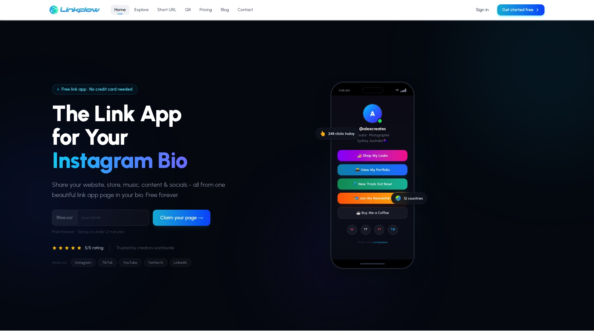
Managing CTA links across Instagram, TikTok, YouTube, and LinkedIn gets complicated fast. Lflow gives content creators and marketers a single branded URL that consolidates every link you need, from product pages to newsletters to video content. The platform includes real-time analytics so you can see exactly which links your audience clicks, plus free QR code generation for offline promotion. Setup takes under two minutes, and you get unlimited links with full customization over colors, fonts, and layout. If you are serious about link in bio performance, Lflow is the tool built specifically for creators who want data alongside design.
FAQ
What is a call to action link?
A call to action link is a clickable element, either a button, inline text, or icon, designed to direct a user toward one specific action such as signing up, purchasing, or downloading. It differs from a standard hyperlink by combining deliberate copy, visual design, and strategic placement to prompt a decision.
Why do inline CTA links outperform sidebar CTAs?
Inline CTAs embedded within article content perform 121% better than sidebar CTAs because they appear at the moment of highest reader engagement, when the user is already processing relevant information and more likely to act.
How many words should a CTA button have?
Research recommends 2 to 5 words for CTA button text. Shorter copy reduces cognitive load, while benefit-driven phrasing such as "Get My Free Report" outperforms generic verbs like "Submit" or "Click Here."
What is a Link Alias and why does it matter for CTA tracking?
A Link Alias assigns a unique label to each CTA pointing to the same destination URL, allowing marketers to track click-through rates per individual button or placement rather than seeing merged aggregate data. Without aliases, it is impossible to know which specific CTA is driving performance.
How do I choose the right CTA for a paid ad campaign?
Match the CTA button verb to your campaign's optimization objective and funnel stage. Using a bottom-of-funnel button like "Buy Now" on a cold awareness campaign sends conflicting signals to the platform algorithm, extending the learning phase and increasing cost per result.