

Mobile optimization is the process of designing and configuring a website so it delivers a fast, easy-to-use experience on smartphones and tablets. It goes far beyond shrinking a desktop layout to fit a smaller screen. Over 57% of global web traffic comes from mobile devices, and 53% of mobile visits abandon if a page takes longer than 3 seconds to load. That combination makes mobile optimization one of the highest-leverage investments a website owner or marketer can make. Get it right, and you keep visitors. Get it wrong, and more than half of them leave before they see a single word of your content.
What are the core components of mobile optimization?
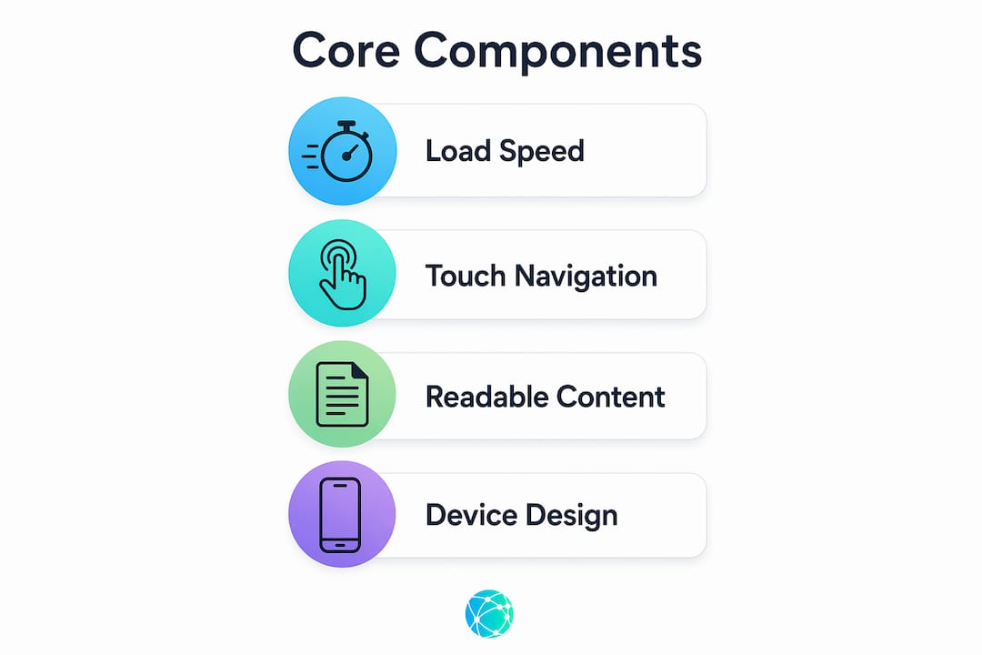
Mobile optimization covers four foundational areas: load speed, touch-friendly navigation, readable content, and device-specific design. Each one affects whether a visitor stays or leaves within seconds.
Load speed
Page speed is the first filter every mobile visitor passes through. Users expect pages to load in under 3 seconds, and sites that miss that threshold see bounce rates climb sharply. The most effective technical fixes include compressing images with formats like WebP, enabling browser caching, and minifying CSS and JavaScript files. These changes reduce the data a browser must process before displaying your page.

Touch-friendly navigation
Mobile screens are operated with thumbs, not mouse cursors. Basic mobile usability standards set a minimum touch target size of 44x44 pixels and a minimum font size of 16px. Buttons placed too close together, or text too small to read without zooming, create friction that pushes visitors away. Designing with these standards in mind removes that friction before it costs you a conversion.
Readable content and formatting
Mobile readers scan rather than read. Short paragraphs, clear headings, and generous white space make content easier to consume on a 6-inch screen. Walls of text that work on a desktop become unreadable on mobile. Breaking content into digestible chunks keeps visitors engaged longer.
Device-specific design
Mobile optimization involves tailoring the entire experience to mobile use cases, not just adjusting layout. That means prioritizing the features mobile users actually need, hiding or collapsing elements that clutter small screens, and designing forms that work with a mobile keyboard. A checkout flow built for desktop often fails on mobile because it requires too many taps and too much typing.
Pro Tip: Run Google's PageSpeed Insights on your site's mobile version monthly. It flags specific issues like render-blocking resources and oversized images, giving you a concrete repair list rather than a vague performance score.
Why does mobile optimization matter for SEO and conversions?
Mobile optimization directly affects where your site ranks on Google and how many visitors convert into customers.
Google uses mobile-first indexing, meaning it crawls and ranks your site based on its mobile version, not the desktop version. A site that performs poorly on mobile will rank lower in search results, even if the desktop experience is excellent. That ranking drop reduces organic traffic before a single visitor ever lands on your page.
The conversion impact is equally direct. About 78% of mobile searches for local businesses result in a store visit or purchase within 24 hours. That statistic reveals how ready mobile searchers are to act. A slow or confusing mobile experience breaks that intent at the worst possible moment.
"Mobile-friendly alone isn't enough. A mobile-first mentality with continuous testing is what converts traffic into customers. Treating mobile as an afterthought means handing those conversions to someone else."
The brand dimension matters too. A poor mobile experience signals to visitors that a business does not take its digital presence seriously. That perception affects trust, and trust affects whether someone buys, books, or contacts you. The mobile gap is a brand problem that shows up across every touchpoint, from your website to your email campaigns to your support pages.
How does mobile optimization differ from responsive design?
Responsive design and mobile optimization are related but not the same thing. Confusing the two is one of the most common and costly mistakes website owners make.
Responsive design means a layout automatically adjusts to fit different screen sizes. The content reflows, columns stack, and images resize. That is a good baseline, but it does not guarantee a good mobile experience. A responsive site can still have tiny buttons, slow load times, and desktop-style navigation that frustrates mobile users.
A mobile-optimized site creates a distinct experience built around how mobile users actually behave. That might mean a simplified checkout flow with fewer steps, a sticky navigation bar positioned at the bottom of the screen for thumb reach, or a click-to-call button that replaces a contact form. These are deliberate design decisions, not automatic layout adjustments.
The table below shows where the two approaches diverge in practice.
| Feature | Responsive design | Mobile-optimized design |
|---|---|---|
| Layout adjustment | Automatic reflow | Custom mobile layout |
| Load speed focus | Minimal | Core priority |
| Navigation design | Desktop adapted | Thumb-first, bottom-anchored |
| Checkout flow | Desktop flow resized | Simplified, fewer steps |
| Ongoing testing | Rarely required | Continuous and required |
Pro Tip: Test your site on a real phone, not just a browser's mobile emulator. Emulators miss real-world issues like tap accuracy, font rendering, and scroll behavior that only appear on actual devices.
A local business website checklist for 2026 confirms that mobile-specific design decisions, not just responsive frameworks, separate high-performing sites from average ones. Mobile optimization is an ongoing, iterative process because user behavior and device capabilities keep changing. A site optimized in 2023 may already be falling behind current standards.
What mobile optimization best practices should you implement?
The most effective mobile optimization strategies combine technical fixes with behavioral design. Here is where to focus your effort.
Technical performance fixes
- Compress all images before uploading. Use WebP format where supported, and set explicit width and height attributes to prevent layout shifts during loading.
- Enable lazy loading so images below the fold only load when a user scrolls to them. This cuts initial page load time significantly.
- Use a content delivery network (CDN) to serve assets from servers closer to your visitors. CDNs reduce latency for users in different geographic regions.
- Minify CSS, JavaScript, and HTML files to reduce file sizes without changing functionality.
- Consider lightweight page frameworks or accelerated mobile page (AMP) implementations for content-heavy pages like blog posts and landing pages.
Behavioral and UX improvements
- Design for one-handed use. Mobile UI must support thumb-first interaction, which means placing primary actions in the lower half of the screen where thumbs naturally reach.
- Simplify forms to the minimum required fields. Every extra field reduces completion rates on mobile.
- Enable digital wallet payment options like Apple Pay and Google Pay to eliminate manual card entry at checkout.
- Keep calls to action visible above the fold without requiring a scroll. Mobile visitors make fast decisions.
- Use behavior analytics tools to identify where mobile users drop off. Heatmaps and session recordings reveal friction points that standard analytics miss entirely.
For creators and marketers managing multiple links across platforms, optimizing your link strategy for mobile visitors is as important as optimizing the destination pages themselves. A mobile user who taps a link in an Instagram bio expects an instant, frictionless experience on the other side.
Key Takeaways
Mobile optimization is the single most important factor separating websites that convert mobile visitors from those that lose them within seconds.
| Point | Details |
|---|---|
| Speed is non-negotiable | 53% of mobile visitors leave if a page loads in more than 3 seconds. |
| Google ranks mobile first | Mobile-first indexing means poor mobile performance hurts your search rankings directly. |
| Responsive design is not enough | True mobile optimization requires distinct layouts, simplified flows, and thumb-first navigation. |
| Behavior analytics reveal real problems | Tools that track mobile sessions show friction points that standard traffic data cannot. |
| Optimization is ongoing | User behavior and device capabilities change constantly, requiring regular testing and updates. |
The mobile gap is bigger than most marketers admit
Most website owners treat mobile optimization as a one-time technical task. Fix the layout, compress the images, check the box. That mindset is why so many sites still bleed mobile traffic despite years of "being mobile-friendly."
What I have seen repeatedly is that the real problem is not technical. It is attitudinal. Teams optimize for desktop because that is where they build and preview their work. They open a browser, drag the window narrower to simulate mobile, and call it done. That is not testing. That is theater.
The sites that genuinely perform on mobile are built by people who use their own site on a phone every week. They notice when a button is hard to tap. They feel the frustration of a form that auto-corrects their email address. They catch the moment a pop-up covers the entire screen and has no visible close button. These are not edge cases. They are the daily reality of your mobile visitors.
The other thing most guides skip: mobile optimization is not just about your website. It is about every touchpoint a mobile user encounters. Your email campaigns, your social media links, your QR codes, your support chat. If any of those experiences break on mobile, the damage to trust is the same as a slow-loading homepage. The mobile gap spans every channel, and closing it requires consistent attention across all of them.
My honest recommendation: pick one mobile friction point this week and fix it. Not a full audit. Not a redesign. One thing. Then do it again next week. That cadence compounds faster than any single overhaul.
— Axion
How Lflow supports your mobile presence
Every link you share on Instagram, TikTok, or LinkedIn lands mobile visitors somewhere. That destination matters as much as the content that drove the click.
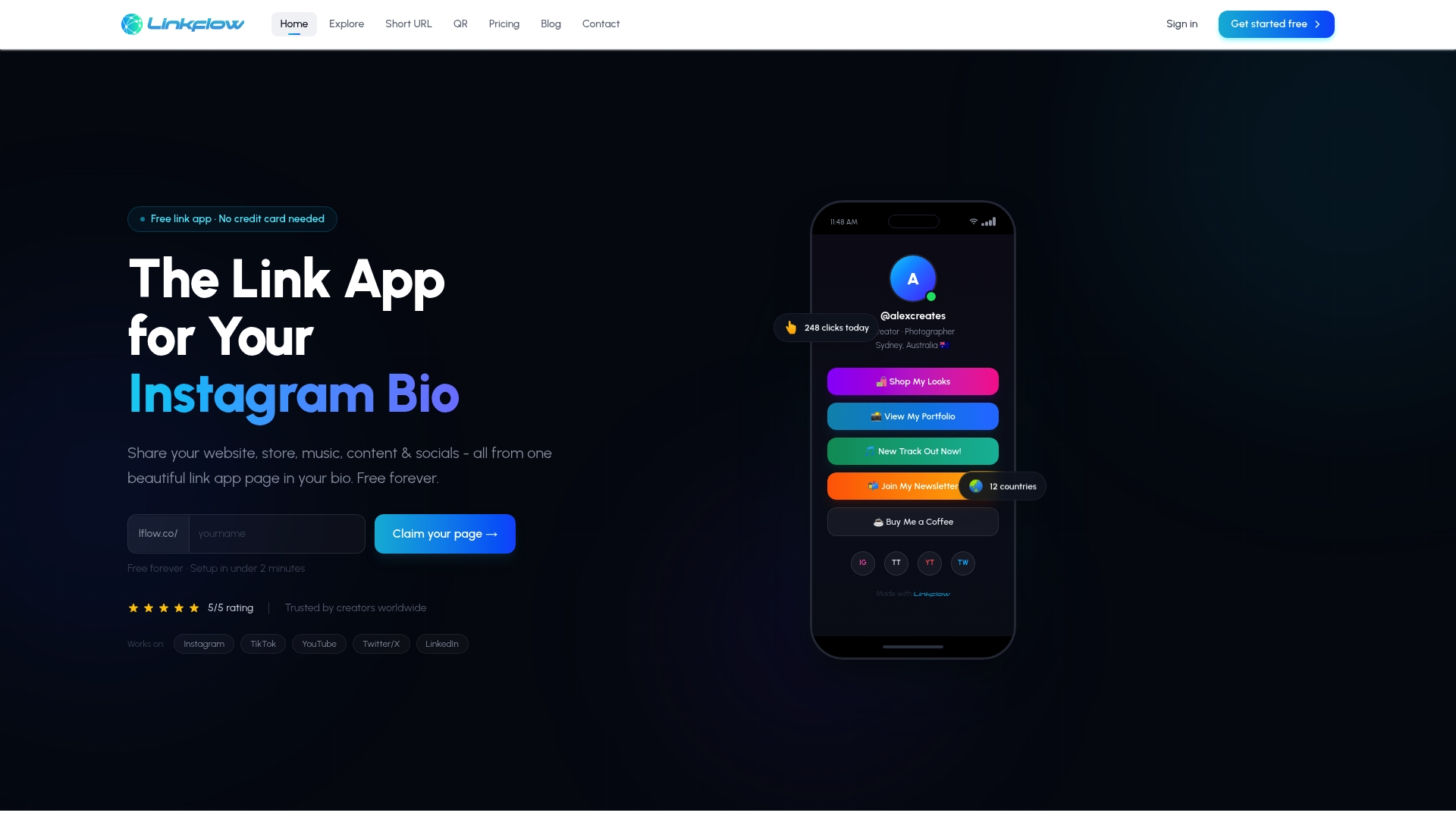
Lflow builds its link in bio templates specifically for mobile visitors, with fast-loading pages, thumb-friendly layouts, and clean designs that work on any screen size. Setup takes under two minutes, and you can consolidate your website, store, videos, and social profiles into one branded URL. Lflow also offers a free QR code generator for offline marketing and a URL shortener for cleaner mobile sharing. If your link destination is slow or hard to navigate, the best mobile optimization work on your main site will not save the conversion. Start with a mobile-ready link hub and build from there.
FAQ
What is mobile optimization in simple terms?
Mobile optimization is the process of making a website fast, easy to read, and easy to navigate on a smartphone or tablet. It goes beyond responsive design by tailoring the entire experience to how mobile users actually behave.
Why does mobile optimization matter for SEO?
Google uses mobile-first indexing, meaning it ranks your site based on its mobile version. A poor mobile experience directly lowers your search rankings, reducing organic traffic regardless of how good your desktop site is.
What is the difference between mobile-friendly and mobile-optimized?
A mobile-friendly site adjusts its layout for smaller screens. A mobile-optimized site creates a distinct experience with faster load times, simplified navigation, and flows designed specifically for touch and thumb use.
How fast should a mobile page load?
Mobile pages should load in under 3 seconds. Pages that exceed that threshold see significantly higher bounce rates, with more than half of mobile visitors leaving before the page finishes loading.
How do I know if my site needs mobile optimization?
Run your URL through Google's PageSpeed Insights and select the mobile tab. A score below 70 signals meaningful performance issues. Also check your analytics for high mobile bounce rates or low mobile conversion rates compared to desktop.