

You can create mobile-optimized pages by following a short, repeatable checklist: build mobile-first, add the viewport meta tag, serve responsive images, compress and defer non-critical assets, design touch-friendly UI, and test with Lighthouse and the Google Mobile-Friendly Test before you ship. Everything else in this guide is detail on how to execute each step well.
Run through this before you touch anything else:
- Set
<meta name="viewport" content="width=device-width, initial-scale=1">in the head - Write CSS mobile-first, then layer in complexity at wider breakpoints
- Serve responsive images with
srcsetand modern formats like WebP or AVIF - Compress and lazy-load everything below the fold
- Make every tap target at least a comfortable minimum size for touch interaction.
- Run Lighthouse mobile and the Mobile-Friendly Test before launch
Pro Tip: Write your critical CSS mobile-first and inline it in the head. That single habit shaves real time off first paint because the browser isn't fighting desktop styles it has to override for small screens.
Key Takeaways
Mobile-optimized pages succeed when mobile-first layout, compressed fast-loading assets, and touch-friendly design are combined and validated with real testing data, not assumptions.
| Point | Details |
|---|---|
| Start mobile-first | Write base CSS for small screens, then layer in complexity with min-width breakpoints. |
| Hit the metric targets | Aim for LCP under 2.5s, CLS under 0.1, and INP under 200ms before sign-off. |
| Serve the right image | Use WebP or AVIF with srcset and sizes so phones never download oversized files. |
| Design for thumbs | Keep tap targets at 44×44px minimum and place CTAs within easy thumb reach. |
| Test before you trust it | Run Lighthouse mobile and the Mobile-Friendly Test, then confirm with Chrome DevTools and real devices. |
| Use a ready-made mobile page when speed matters | Lflow's link-in-bio pages are mobile-optimized by default for campaigns, bios, and QR-code entry points. |
Table of Contents
- Why Mobile Optimization Matters Now
- How Do You Check If a Page Is Mobile-Friendly?
- Core Layout Techniques: Mobile-First CSS and Flexible Grids
- Optimize Images and Video for Mobile
- What Performance Metrics Matter Most on Mobile?
- Design Touch-Friendly Navigation and CTAs
- Make Forms and Checkout Mobile-Friendly
- Readable, Accessible Mobile Typography
- SEO and Mobile-First Indexing: What You Need to Know
- Tooling and a Practical Testing Workflow
- Prioritizing Pages and Working With Developers
- Progressive Web Apps: Do You Need One?
- Use Rem and Em Instead of Fixed Pixel Units
- Design for Weak Signal and Offline Access
- Control Viewport Scaling and Zoom Behavior
- Frequently Asked Questions
- Sources
Why Mobile Optimization Matters Now
More than half of all global web traffic now comes from phones, according to Statista, which means a page that performs poorly on mobile is failing the majority of your visitors, not an edge case. The business case is direct:
- Higher engagement and lower bounce rates on pages that load fast on cellular connections
- Better conversion rates when checkout and forms work smoothly on small screens
- Stronger organic visibility, since Google evaluates your mobile version first
A one-second load-time improvement can lift mobile conversions by roughly 7%, an outcome that dwarfs most redesign budgets.
How Do You Check If a Page Is Mobile-Friendly?
Before rebuilding anything, find out what's actually broken. This takes ten minutes with free tools:
- Run your URL through the Google Mobile-Friendly Test
- Pull a Lighthouse mobile report in Chrome DevTools and note your Performance and Accessibility scores
- Open Chrome DevTools' device toolbar and simulate a mid-range Android phone, not just an iPhone
- Check LCP, CLS, and INP against Core Web Vitals targets
- Cross-check on a real device or through BrowserStack if you support older Android hardware
Red flags that need same-day fixes: horizontal scroll bars, tap targets under 44px, and a Largest Contentful Paint slower than 2.5 seconds.
Core Layout Techniques: Mobile-First CSS and Flexible Grids
Write your base styles for the smallest screen first, then add complexity with min-width media queries as space allows. This is the opposite of the old desktop-down approach, and it forces you to prioritize content instead of decoration. MDN's responsive design guidance covers the underlying mechanics of fluid grids, flexible images, and media queries in depth.
Use CSS Grid for two-dimensional page structure (header, sidebar, content, footer) and Flexbox for one-dimensional component alignment (a nav bar, a card's internal layout). Trying to force Grid to do Flexbox's job, or vice versa, is where most layout headaches start.
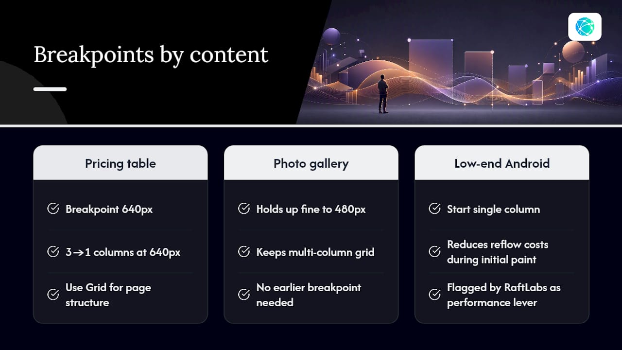
Pick breakpoints based on where your own content breaks, not standard device widths. A three-column pricing table might need a breakpoint at 640px while a photo gallery holds up fine to 480px. Starting with a single column on low-end Android hardware also reduces reflow costs during initial paint, a detail RaftLabs flags as a meaningful performance lever.
For 2026 builds, container queries let a component adapt to its own parent's width rather than the viewport, which is often what you actually want. Scrimba's 2026 guide pairs container queries with intrinsic Grid to cut down on breakpoint sprawl significantly.
Pro Tip: Use clamp() for font sizes and spacing, like font-size: clamp(1rem, 2vw, 1.5rem). It scales fluidly between screen sizes without a single extra media query.
Optimize Images and Video for Mobile
Images are usually the heaviest thing on a mobile page, and they're the easiest to fix. Switch to WebP or AVIF, which compress noticeably better than JPEG at equivalent visual quality, and reserve a fallback only if you support very old browsers.
- Use
srcsetandsizesso the browser downloads the smallest image that still looks sharp, not a desktop-sized file shrunk by CSS - Add
aspect-ratioor explicit width and height attributes so the browser reserves space before the image loads - Lazy-load anything below the fold with
loading="lazy" - Use a poster image for video elements so mobile users aren't forced to download video data just to see a still frame
Skipping the sizes attribute is a common mistake. Without it, browsers often assume the image will render at full viewport width and download a needlessly large file, even on a phone.
What Performance Metrics Matter Most on Mobile?
Google's Core Web Vitals set the bar: aim for Largest Contentful Paint under 2.5 seconds, Cumulative Layout Shift under 0.1, and Interaction to Next Paint under 200 milliseconds, targets laid out in Web. Phones on mid-tier processors and spotty connections miss these thresholds constantly, which is exactly why they matter more here than on desktop.
Fix these in rough priority order:
- Compress and resize every image before it ever reaches production
- Defer or split non-critical JavaScript so it doesn't block rendering
- Serve static assets through a CDN with long cache lifetimes
- Simplify the DOM. Fewer nested elements means faster style recalculation and fewer reflows
Lab data from Lighthouse or PageSpeed Insights tells you what's happening under controlled conditions. Real User Monitoring tells you what's happening on your visitors' actual phones, on actual networks, which is often worse. You need both. A site can score well in the lab and still frustrate real users on a train with two bars of LTE.
Design Touch-Friendly Navigation and CTAs
Every tappable element needs a minimum target of 44×44 pixels, with enough padding around it that a thumb doesn't accidentally hit the wrong link. Figma's mobile design research consistently points to simplified, vertical layouts with large touch targets as the pattern that performs best across device sizes.

Place your primary CTA within easy thumb reach, typically the bottom half of the screen, not tucked in a top corner. Sticky bottom CTAs and bottom tab navigation both work well for this reason.
Avoid these anti-patterns:
- Tiny inline text links stacked close together
- Interactions that depend on hover, which doesn't exist on touchscreens
- Pop-ups that cover the screen the moment someone lands on the page
| Design Element | Mobile Guideline |
|---|---|
| Tap target size | Minimum 44×44px with adequate spacing |
| CTA placement | Bottom half of screen, within thumb reach |
| Navigation pattern | Bottom tabs or hamburger, not a full desktop menu |
Make Forms and Checkout Mobile-Friendly
Use the right input type for the job. type="tel" triggers a numeric keypad, type="email" brings up an @ key, and this alone removes friction most forms never fix.
- Enable address autocomplete and offer Apple Pay or Google Pay where checkout allows it
- Keep forms short and cut any field that isn't essential
- Use visible labels above fields instead of relying on placeholder text, which disappears the moment someone starts typing
- Show inline validation as the user types, not a wall of errors after they hit submit
Shopify's mobile UX research ties these exact patterns to smoother checkout completion on phones.
Readable, Accessible Mobile Typography
Set body text no smaller than 16px. Anything smaller forces zooming, and zooming breaks your layout and your user's patience simultaneously. Pair that with a line-height around 1.5 for comfortable reading on a small screen.
Check color contrast against WCAG minimums, and make sure focus indicators are visible for anyone navigating by keyboard or switch control. Quick accessibility checks worth running:
- Test with VoiceOver on iOS or TalkBack on Android
- Run a contrast checker on your primary text and background colors
- Try navigating your page using only a keyboard
SEO and Mobile-First Indexing: What You Need to Know
Google crawls and indexes the mobile version of your site first, full stop. That means your mobile page needs the same primary content, structured data, and meta tags as desktop, according to Google's own mobile-first indexing guidance.
Check for these common mistakes:
- Content hidden behind a "read more" tap that Google's crawler may not execute
- Structured data present on desktop but missing on mobile
- Meta descriptions or title tags that differ between versions
- Images or resources blocked from crawling on the mobile template
If you run a responsive design (the configuration Google recommends), content parity is largely automatic since both experiences share the same HTML. Separate mobile URLs or dynamic serving require far more manual diligence to keep in sync.
Tooling and a Practical Testing Workflow
Build a repeatable loop instead of testing once and forgetting about it:
- Establish a baseline with Lighthouse mobile and PageSpeed Insights
- Fix the highest-impact issue first, usually images or render-blocking JS
- Re-test with the same tools to confirm the fix worked
- Monitor ongoing performance with Real User Monitoring data
Your toolkit: Lighthouse for lab scoring, PageSpeed Insights for both lab and field data, the Google Mobile-Friendly Test for a quick pass/fail read, Chrome DevTools for hands-on debugging, and BrowserStack when you need to confirm behavior on real device hardware you don't own.
Before signing off on any page, hold it to LCP under 2.5 seconds, CLS under 0.1, and INP under 200ms.
Prioritizing Pages and Working With Developers
Not every page deserves attention on day one. Rank pages by traffic, revenue contribution, current conversion rate, and how complex the fix actually is. A high-traffic landing page with a five-minute image fix beats a low-traffic page needing a full rebuild.
- Start with pages that combine high traffic and low technical complexity
- Use feature flags to roll out layout changes to a percentage of visitors before a full launch
- Ship critical CSS changes incrementally rather than all at once
- A/B test major UI changes instead of assuming the new version wins
A simple one-week sprint for a small team: day one, audit and prioritize with Lighthouse; days two through four, implement fixes on the top three pages; day five, re-test and deploy behind a flag; the following week, monitor RUM data and expand the rollout. Track uplift against your baseline numbers so the sprint has a measurable outcome, not just a shipped feature.
Progressive Web Apps: Do You Need One?
A Progressive Web App (PWA) is a website built to behave like a native app: it can be added to a home screen, launch in its own window, and work partially offline through a service worker that caches key assets. You don't need one to have a mobile-optimized page, but PWAs solve specific problems regular pages don't.
The core benefits worth knowing:
- Home screen installation without an app store submission process
- Offline or low-connectivity access to previously cached content
- Push notifications for re-engagement, something a standard web page can't do
- App-like transitions and load speed once assets are cached locally
A service worker is the technical backbone. It intercepts network requests and can serve cached responses when connectivity drops, which matters for content sites and e-commerce catalogs where a visitor might lose signal mid-session. Adding a web app manifest file, a small JSON file specifying your app's name, icons, and theme color, is what enables the "add to home screen" prompt.
PWAs make the most sense for content-heavy sites with repeat visitors, tools people use daily, and e-commerce brands whose customers browse on the move. A simple marketing landing page rarely benefits enough to justify the added engineering complexity. If your bounce rate is high and your average session is under a minute, fix your core page speed and layout first. A PWA layer on top of a slow page just means an app-like wrapper around the same problem.
Use Rem and Em Instead of Fixed Pixel Units
Fixed pixel values for font sizes and spacing ignore a fact of mobile browsing: users adjust their system text size, and a page built entirely in pixels doesn't respond to that setting at all.
rem units scale relative to the root HTML font size, typically 16px by default, so 1rem equals 16px unless the user or browser changes that base. em units scale relative to their immediate parent element, which makes them useful for component-level spacing but riskier for anything nested multiple levels deep, since the scaling compounds.
A practical pattern: set your root font size once, then define type scale, margins, and padding in rem throughout the rest of your stylesheet. Reserve em for spacing that should scale with a specific component's own font size, like padding inside a button that grows or shrinks alongside its label text.
This matters more on mobile than desktop for a simple reason: phone accessibility settings for text scaling are used far more often than the desktop equivalent, and a page built in fixed pixels breaks that experience entirely. Combine rem typography with the clamp() pattern mentioned earlier and you get type that scales both with viewport width and with user accessibility preferences, without writing a single extra media query for font sizing.
Design for Weak Signal and Offline Access
Mobile users switch between fast WiFi, spotty 4G, and dead zones constantly, often within the same five-minute session, and a page built only for a strong lab connection will fail plenty of real visits. Test your page's behavior under throttled conditions using Chrome DevTools' network throttling presets, which simulate slow 3G and mid-tier 4G speeds directly in the browser.
A few strategies matter more than others here:
- Prioritize critical CSS and above-the-fold content so something useful renders even if the rest of the page is still loading
- Set reasonable timeouts and show a clear loading state instead of a blank screen during a slow connection
- Cache static assets aggressively so repeat visits don't re-download unchanged files
- Use a service worker to serve a lightweight offline fallback page instead of the browser's generic "no internet" error
Reduced motion and reduced data preferences, both readable through CSS media features, let you skip heavy animations or high-resolution assets for users who've signaled they want a lighter experience. Respecting prefers-reduced-data where supported is a small technical step that meaningfully improves the experience for anyone on a limited data plan.
None of this requires a full PWA build. Even a static site benefits from aggressive caching headers and a lean critical rendering path, since both directly reduce how much the browser has to fetch before showing something usable on a weak connection.
Control Viewport Scaling and Zoom Behavior
The viewport meta tag does more than set device width. Its initial-scale and maximum-scale properties control how users can zoom, and getting this wrong creates two very different problems.
Set it correctly with <meta name="viewport" content="width=device-width, initial-scale=1">. This tells the browser to match the layout width to the device's own width and start at 100% zoom, which is the baseline every responsive layout assumes.
Resist the temptation to add user-scalable=no or maximum-scale=1 to lock out pinch-to-zoom. It might look tidy in your own testing, but it actively harms accessibility for users with low vision who rely on zoom to read your content at all, and most modern accessibility guidelines flag it as a usability violation. If your design looks broken when a user zooms in, that's a layout bug to fix, not a reason to disable zoom entirely.
The one legitimate exception is a page with genuinely interactive, app-like controls, like a canvas-based tool or game, where zoom gestures might conflict with intentional pinch or drag interactions built into the interface itself. Even then, disable zoom only on that specific screen, not sitewide.
A Note on Shipping This in the Real World
Every checklist in this guide comes from patterns that consistently separate fast, usable mobile pages from slow, frustrating ones: mobile-first CSS, disciplined image handling, and metrics you actually track instead of guess at. The gap between knowing this and doing it usually isn't understanding. It's sequencing: knowing which fix to make first when you don't have unlimited engineering time.
Pick one landing page this week, run it through Lighthouse mobile, fix the single worst offender (usually an unoptimized hero image or a render-blocking script), and re-test. That one small loop, repeated across your highest-traffic pages, does more for your mobile experience than a full redesign most teams never finish.
When a Full Rebuild Isn't What You Need
Not every mobile-optimized experience requires a rebuilt website. If you're running a campaign, promoting a single offer through a QR code on packaging, or need a clean landing spot for an Instagram or TikTok bio, a full responsive site redesign is often the wrong tool for the job entirely. What you need instead is a page that's mobile-optimized by default, with zero CSS to write and zero breakpoints to test.
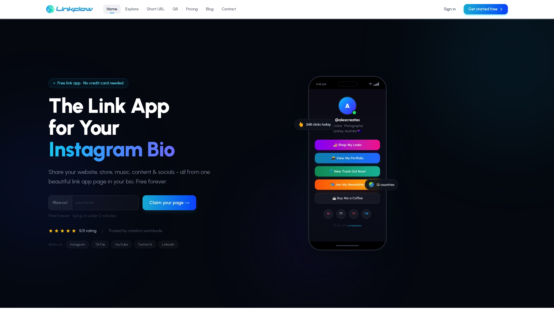
That's the specific gap Lflow fills. Every page built on the platform is already responsive, fast-loading, and touch-friendly out of the box, which means the layout, image, and tap-target work covered throughout this guide comes built in rather than something you configure yourself. Set up a branded link-in-bio page in under two minutes, add a free QR code for print or packaging, and you have a mobile-optimized entry point live before a from-scratch landing page would even clear its first design review. For teams that also need trackable campaign links, Lflow's URL shortener adds click analytics without extra setup. Start with the free plan and see how quickly a properly mobile-optimized page can go live.
Frequently Asked Questions
What's the fastest way to check if my page is mobile-optimized? Run it through the Google Mobile-Friendly Test and a Lighthouse mobile report. Together they take under ten minutes and flag the most common problems: tiny tap targets, slow LCP, and layout shift.
Do I need a separate mobile website, or is responsive design enough? Responsive design is what Google recommends and what most modern sites use, since one codebase serves every screen size and keeps mobile-first indexing simple. Separate mobile URLs require extra work to keep content and structured data in sync.
How small can body text be on mobile before it hurts readability? Keep body text at 16px or larger. Anything smaller forces users to pinch-zoom, which breaks reading flow and often signals a page that wasn't designed mobile-first.
Does a Progressive Web App help my mobile SEO? Not directly, but the performance improvements a PWA often brings, faster repeat loads and cached assets, can indirectly support better Core Web Vitals scores, which do factor into mobile search performance.
What's a realistic first fix if I only have time for one thing?
Compress and properly size your hero image with srcset. It's usually the single largest asset on the page and often the easiest fix with the biggest visible speed improvement.
Sources
- Mobile-first Indexing Best Practices | Google Search Central
- Web
- Scrimba — Responsive web design: A complete guide 2026
- RaftLabs — 10 mobile-first design tips for exceptional user experiences