

A responsive link hub is a single-page destination that adapts its layout, content, and link visibility dynamically based on the user's device, location, or behavior. The best examples of responsive link hubs, including Smart-Link, Linkgrid, and GlassLink-Bio, go far beyond a simple list of URLs. They combine smart display rules, mobile-first design, and real-time analytics to deliver personalized experiences that convert casual visitors into engaged followers. For content creators, influencers, and marketers, the difference between a static link page and a truly responsive hub is measurable in clicks, audience retention, and brand credibility.
1. What makes a link hub truly responsive and dynamic?
Responsiveness in a link hub means more than fitting a screen. A genuinely dynamic hub adapts what it shows, not just how it looks. That distinction separates the tools worth your time from the ones that just look good in a screenshot.
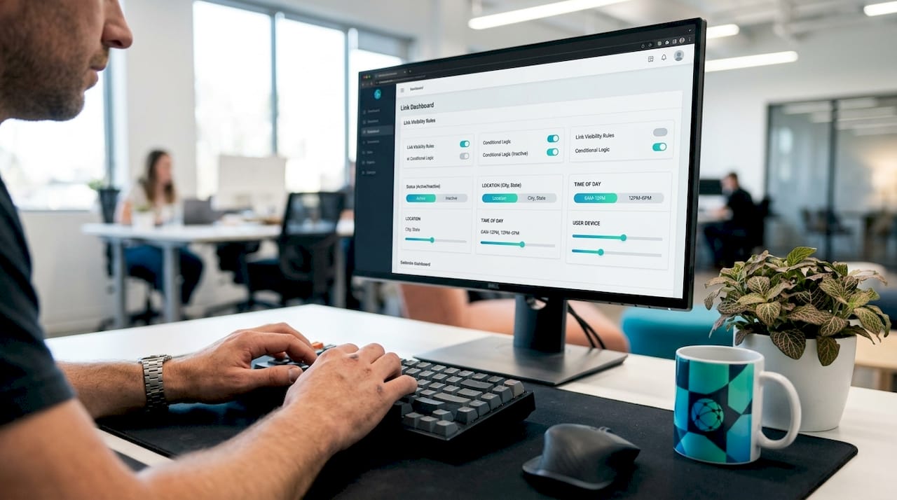
The most advanced hubs use smart display rules to control link visibility based on context. Smart display rules let you show a limited-time offer only during a product launch window, surface a mobile app download link exclusively to smartphone users, or hide a desktop-only tool from phone visitors entirely. That level of personalization directly improves click-through rates because every visitor sees only what is relevant to them.
Performance is the second pillar. Zero JavaScript runtime overhead in a link hub means faster first-load times on mobile, fewer layout shifts, and better Core Web Vitals scores. Most visitors arrive from Instagram or TikTok on a phone with a variable connection, so a hub that loads in under a second has a real competitive advantage over one that loads in three.
The third pillar is accessibility. Semantic HTML and accessible markup make a hub readable by screen readers, indexable by search engines, and usable on older devices. Accessibility is not a checkbox. It expands your reach to audiences that many creators overlook entirely.
- Smart display rules: Show or hide links based on time, device type, or geographic location
- Mobile-first layout: Design for the smallest screen first, then scale up
- Minimal JavaScript: Prioritize CSS and HTML for speed and stability
- Semantic markup: Use proper heading hierarchy and landmark elements for SEO and accessibility
- Real-time analytics: Track which links get clicked, by whom, and when
Pro Tip: Test your link hub on a throttled 3G connection using Chrome DevTools before publishing. If it loads slowly there, most of your mobile audience will bounce before they see a single link.
2. Smart-Link: conditional logic for power users
Smart-Link is an open-source link hub built around a rules engine that gives creators precise control over what each visitor sees. Its smart rules engine supports conditional display based on time windows, device type, and user location, making it one of the most technically capable free options available.
Beyond the rules engine, Smart-Link includes real-time analytics with CSV export and download-ready QR codes. Those two features together solve a problem most basic link pages ignore: you cannot improve what you cannot measure, and you cannot promote offline without a physical code. A musician using Smart-Link could show a Spotify link only to mobile users, display a vinyl pre-order link only during a two-week launch window, and track exactly how many people clicked each option.
The setup requires some technical comfort since it is self-hosted, but the payoff is a hub with no platform fees and complete data ownership.
3. Linkgrid: the no-code option with serious features
Linkgrid is built for creators who want a feature-rich hub without writing a single line of code. It ships with five built-in themes, drag-and-drop link reordering, live search filtering, automatic favicon fetching, and a web-based settings panel. The result is a hub that looks professionally designed and behaves like a polished product from day one.
The live search feature is genuinely underrated. If you manage more than ten links, a visitor searching for your podcast or your store saves time instead of scrolling. Linkgrid also includes built-in analytics and accessibility-ready design, which means it performs well for both users and search engines without any extra configuration.
Linkgrid is a strong choice for marketers managing multiple campaigns who need to update links frequently without developer help.
4. GlassLink-Bio: design-forward with SEO built in
GlassLink-Bio takes a different approach by leading with aesthetics and backing them with technical substance. Its glassmorphism design uses frosted-glass card effects and animated backgrounds that make a creator's page feel like a branded experience rather than a utility page.
What separates GlassLink-Bio from purely decorative templates is its SEO and GEO optimization layer. It includes Open Graph tags, Twitter Card metadata, JSON-LD schema markup, and a portfolio gallery section. That combination means the page is shareable on social media with rich previews and discoverable via search engines. For creators building a long-term audience, that discoverability compounds over time in a way that a plain link list never will.
The mobile-first responsive layout and smooth reveal animations also reduce bounce rates by making the page feel intentional and fast.
5. Astro Link-In-Bio: performance as a design principle
Astro Link-In-Bio is built on the Astro framework, which ships zero JavaScript to the browser by default. That architectural choice means the hub loads almost instantly on any device, with no layout jank and no render-blocking scripts. For creators whose audience skews toward mobile-heavy platforms like TikTok or Instagram, that performance advantage translates directly into more clicks.
The template also includes beautiful CSS animations that run entirely in the browser without JavaScript overhead. You get visual polish without the performance cost. Developers who want a starting point for a custom hub will find Astro Link-In-Bio one of the cleanest codebases available, with a structure that is easy to extend.
6. Personal LinkHub: accessibility and analytics combined
Personal LinkHub uses vanilla HTML, CSS, and JavaScript with no frameworks or dependencies. That zero-bloat approach produces a hub that is fast, accessible, and easy to audit. It includes semantic landmark elements, dark theme support, and integrated Google Analytics for click tracking.
The accessibility compliance is particularly notable. Proper landmark elements mean screen reader users can navigate the page efficiently, and the semantic structure gives search engines clear signals about the page's content hierarchy. For creators who care about reaching every segment of their audience, Personal LinkHub sets a standard that many commercial tools fail to meet.
The integrated telemetry tracks individual link clicks, giving you engagement data without a third-party analytics subscription.
7. How to choose or build your own responsive link hub
Choosing the right link hub depends on four factors: your engagement goals, the features you actually need, your technical capacity, and your budget. Most creators overbuild or underbuild because they skip this assessment.
Follow this decision framework:
- Define your primary goal. Are you driving sales, growing a newsletter, or consolidating your social profiles? Each goal favors different features.
- List your required features. Analytics, smart rules, SEO markup, and custom domains are not all necessary for every creator. Prioritize ruthlessly.
- Assess your technical comfort. Self-hosted open-source tools like Smart-Link give you full control but require a server. Managed platforms trade control for simplicity.
- Consider your hosting options. GitHub Pages, Netlify, and Vercel all offer free static hosting for open-source templates. A managed SaaS platform removes that step entirely.
- Plan your internal linking. Two-way linking between your hub and your deeper content pages improves SEO by signaling topical relevance to search engines. Your hub should link out to key pages, and those pages should link back to your hub.
- Test on mobile first. Use real devices, not just browser emulators, to confirm that tap targets are large enough and that load times are acceptable on a cellular connection.
Pro Tip: Start with a lightweight open-source template and customize it incrementally. Launching a simple, fast hub today beats spending three weeks perfecting a complex one that never ships.
For creators who want creative link-in-bio ideas beyond the standard layout, experimenting with grid-based designs or category-filtered views can significantly increase time on page.
8. Comparison of responsive link hub examples
The table below contrasts the five examples covered in this article across the criteria that matter most for creators and marketers.
| Hub | Dynamic rules | Analytics | SEO markup | No-code setup | Performance focus |
|---|---|---|---|---|---|
| Smart-Link | Yes (time, device, location) | Real-time + CSV | Basic | No (self-hosted) | Moderate |
| Linkgrid | No | Built-in | Basic | Yes | Moderate |
| GlassLink-Bio | No | No | Advanced (JSON-LD, OG) | Yes | High |
| Astro Link-In-Bio | No | No | Basic | No (developer) | Highest |
| Personal LinkHub | No | Google Analytics | Semantic HTML | No (developer) | High |
Smart-Link wins on personalization. Linkgrid wins on ease of use. GlassLink-Bio wins on SEO and visual design. Astro Link-In-Bio wins on raw performance. Personal LinkHub wins on accessibility. The right choice depends entirely on which column matters most to your specific audience and workflow. Creators who want multi-link page growth without technical overhead should prioritize no-code options with built-in analytics.
Key takeaways
The most effective responsive link hubs combine smart display rules, mobile-first performance, semantic markup, and real-time analytics to maximize engagement across every device and context.
| Point | Details |
|---|---|
| Dynamic rules drive personalization | Smart-Link's conditional display rules show the right link to the right visitor at the right time. |
| Performance requires minimal JavaScript | Astro Link-In-Bio proves that zero JS runtime produces the fastest, most stable mobile experience. |
| SEO needs structured markup | GlassLink-Bio's JSON-LD and Open Graph tags make a hub discoverable and shareable beyond social media. |
| No-code options are genuinely capable | Linkgrid delivers themes, analytics, and drag-and-drop management without a single line of code. |
| Two-way linking amplifies SEO | Linking from your hub to spoke pages and back signals topical relevance to search engines and users alike. |
Why most link hubs underperform, and what I've learned from the best ones
After reviewing dozens of link hub implementations, the pattern I see most often is creators choosing a tool based on how it looks in a demo rather than how it performs under real conditions. A glassmorphic design is genuinely impressive. But if it loads in four seconds on a mid-range Android phone, it is costing you clicks every single day.
The hubs that consistently outperform are the ones built around a clear hierarchy: speed first, then structure, then style. Astro Link-In-Bio taught me that you can have beautiful animations without a single kilobyte of JavaScript reaching the browser. Personal LinkHub showed me that vanilla HTML with proper semantic landmarks outperforms bloated frameworks on both accessibility audits and search rankings.
The feature I see most underused is two-way linking. Creators build a hub and treat it as a dead end. The smarter move is to treat your hub as the center of a content network, linking out to your best articles, videos, and product pages, and making sure those pages link back. That structure communicates authority to search engines in a way that a standalone page never can.
My honest recommendation: start with an open-source template, strip it down to what you actually need, and measure everything from day one. The creators who iterate based on real click data consistently outperform those who optimize by instinct.
— Axion
Build your own responsive link hub with Lflow
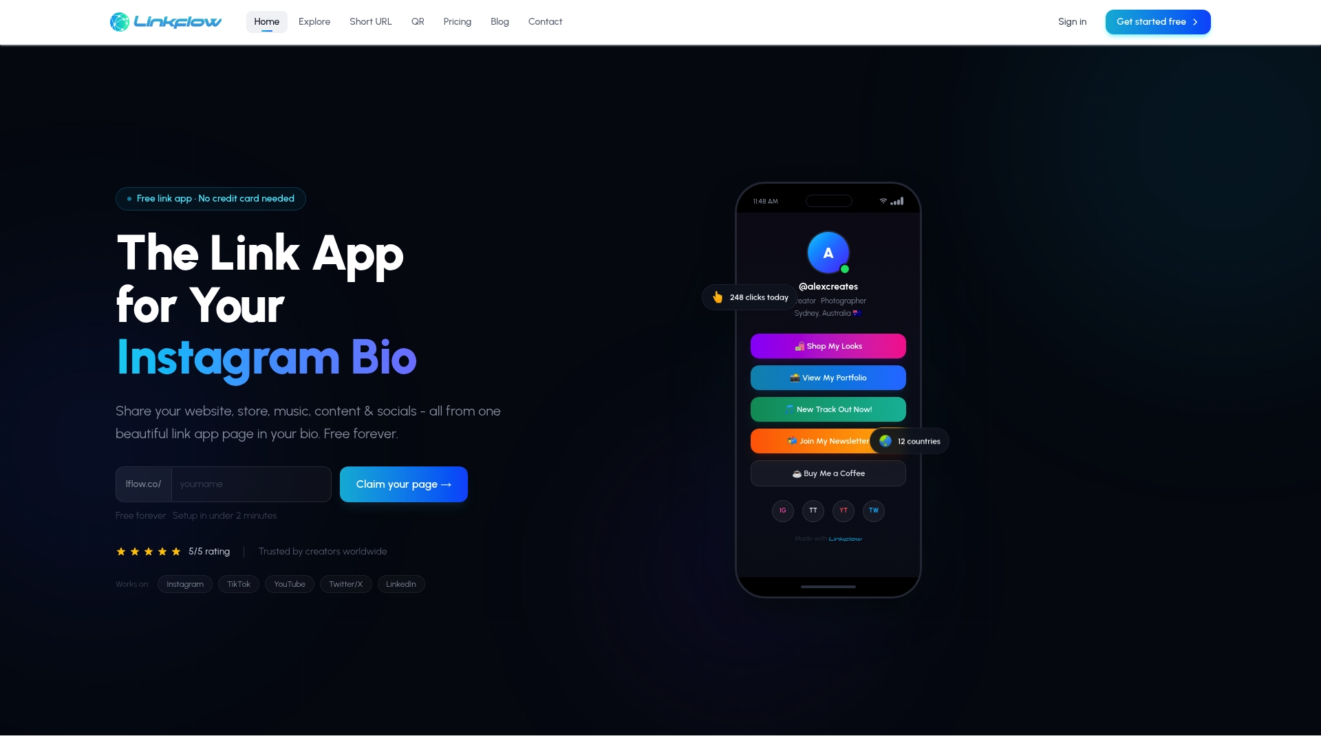
Lflow gives content creators and marketers a free link in bio page that combines everything covered in this article into a single, managed platform. You get unlimited links, real-time analytics, fully responsive mobile-optimized design, and a free QR code generator for offline promotion, all set up in under two minutes. No server configuration, no code, and no monthly fee to get started. Custom domains, themes, fonts, and colors let you match your brand exactly. If you want the performance and personalization of the best link hub design examples without the technical overhead, Lflow is the direct path from this article to a live, professional hub.
FAQ
What is a responsive link hub?
A responsive link hub is a single-page destination that adapts its layout and content to the user's device, screen size, and context. The best examples combine mobile-first design with dynamic display rules and real-time analytics.
What are the best features of effective link hubs?
The features of effective link hubs include smart display rules for conditional link visibility, semantic HTML for SEO and accessibility, real-time analytics for performance tracking, and mobile-first layouts for fast load times on phones.
How do I create a responsive link hub without coding?
Platforms like Lflow and tools like Linkgrid offer no-code setup with drag-and-drop management, built-in themes, and analytics. Both options produce fully responsive hubs without requiring any technical knowledge.
How does a link hub improve SEO?
A link hub improves SEO through structured markup like JSON-LD and Open Graph tags, plus two-way linking between the hub and deeper content pages. That internal linking structure signals topical relevance to search engines and improves crawlability.
What is the fastest type of responsive link hub?
Hubs built with zero JavaScript runtime, like those using the Astro framework, produce the fastest load times on mobile devices. Minimizing JavaScript overhead directly improves Core Web Vitals scores and reduces bounce rates on slow connections.