

A musician landing page is a purpose-built webpage that combines artistic branding with strategic marketing to drive fan engagement and industry attention. Unlike a full website, it focuses a visitor's attention on one clear goal: stream, buy, follow, or book. The best examples of musician landing pages share four traits: a strong hero visual, curated audio, a direct call to action, and mobile-first design. This guide breaks down what those pages do well, so you can build one that works just as hard.
What are standout examples of musician landing pages?
The strongest musician landing pages treat every pixel as intentional. A professional musician landing page should include a compelling hero image or video, a brief 200-word biography, 5 to 10 curated tracks, clear calls to action, and a mobile-responsive layout. Cluttered pages reduce conversions. Simplicity and speed are the real design goals.
1. The single-release page
A single-release page exists for one purpose: drive pre-saves and streams for a new track. The hero section fills the screen with album art and a "Pre-Save Now" button above the fold. Below it, a 30-second audio preview plays inline. The best versions add a countdown timer to release day, which creates urgency without any copy.

Pro Tip: Place your Pre-Save CTA within the first 200 pixels of the page. Visitors who scroll past that point are already less likely to convert.
2. The tour announcement page
Tour pages lead with dates, not biography. A map showing upcoming cities sits at the top, followed by a date-by-date list with direct ticket links. Bands like this format because it removes friction: a fan in Austin sees the Austin date immediately and clicks buy. No scrolling through press quotes first.
- Embed a live ticket widget rather than linking out to a third-party site
- Show sold-out dates to signal demand
- Include a mailing list sign-up for fans in cities not yet on the tour
3. The artist portfolio page
Portfolio pages serve two audiences at once: fans and industry professionals. Musician websites function as centralized hubs for direct fan connections, with biography, tour dates, discography, merch links, and social media integrations as core elements. The key is layering. Fans see the story. Industry visitors find the press kit, contact info, and streaming stats without digging.
4. The merch-forward landing page
Some artists build their entire landing page around a product drop. The hero image shows the merch, not the artist. A short video of the artist wearing or using the item plays on loop. Below the fold, a grid of product shots links directly to the store. This format works especially well for artists with strong visual identities, where the merch is part of the brand.
5. The music supervisor pitch page
This page type is built for industry gatekeepers, not fans. Industry professionals distinguish between fan-facing sites focused on engagement and industry-facing portfolios curated for music supervisors and labels. A pitch page strips out merch, news, and social feeds. What remains: a clean tracklist, licensing contact info, genre tags, and streaming stats. Nothing else.
Pro Tip: On a pitch page, lead with your most commercially placed or emotionally striking track, not your newest one. First impressions with supervisors are decided in under 10 seconds.
6. The link-in-bio hub page
This is the most common format for independent artists in 2026. A single branded URL consolidates links to streaming platforms, a merch store, a mailing list, and social profiles. Lflow is built specifically for this format, letting musicians create a mobile-optimized hub in under two minutes. The Midnight Tour template is a strong starting point for artists who want a dark, tour-focused aesthetic.
7. The album campaign page
Album pages go deeper than single pages. They include a full tracklist with inline previews, a narrative about the record's creation, press quotes, and a buy or stream button for each format. The best album pages feel like a magazine spread. They reward fans who want the full story while keeping the primary CTA visible at all times.
8. The fan community page
Community pages prioritize sign-ups over streams. The hero section leads with an exclusive offer: early ticket access, a free download, or a private Discord invite. The email capture form sits above the fold. Everything else, including the bio and music player, comes after. This format works best for artists with an existing audience who want to move fans off social platforms and onto a direct list.
How design trends like dark mode and modular layouts shape musician pages
Modern musician landing pages in 2026 emphasize dark-mode designs with data-driven visuals like streaming statistics and listener location maps. These features appeal to industry gatekeepers assessing market viability. A dark background makes album art and video content pop without any extra effort.
Modular card grid layouts let artists present multiple content types without overwhelming the visitor. One card holds the latest single. The next shows upcoming tour dates. A third links to the merch store. Each card is self-contained, so visitors can scan and click without reading a wall of text.
"Trending design templates favor dark mode and modular content sections that allow artists to showcase music, events, merchandise, and press information cohesively."
The Gallery Dark template and Mono Dark template from Lflow both follow this pattern. They use high-contrast typography and card-based layouts that load fast on mobile. For artists who prefer a lighter aesthetic, the Light Studio template applies the same modular structure with a clean white background.
One underused design technique is the reward color system. Effective landing pages use high-contrast colors like chartreuse or magenta that appear upon CTA clicks to reinforce user action and guide conversions. The visual reward tells the visitor their click registered and nudges them toward the next step.
Which functional elements are crucial on musician landing pages?
Audio quality matters more than most musicians realize
Professional music portfolios embed high-quality audio at 320 kbps or better inline, unlike generic website builders. A compressed, tinny preview undermines the music before a supervisor or fan has finished listening. Inline audio also keeps visitors on the page. Linking out to Spotify or Apple Music sends them away and breaks the conversion flow.
Calls to action need to be specific and singular
Every page should have one primary CTA. "Pre-Save," "Buy Tickets," "Join the List," and "Stream Now" are all strong options. The mistake most musicians make is using all four on the same page at the same level of visual weight. Pick one. Make it large, high-contrast, and above the fold. Secondary CTAs can live lower on the page in smaller type.
- Place the primary CTA in the hero section, above the fold
- Repeat it once at the bottom of the page for visitors who scroll all the way down
- Use a reward color on click to confirm the action visually
- Test button copy: "Pre-Save Now" outperforms "Click Here" in every format
Pro Tip: Keep your biography under 200 words on any landing page. Visitors who want more will find it. Visitors who don't will leave if the page reads like a press kit.
Mobile responsiveness is not optional
The majority of music fans discover and engage with artists on their phones. A page that looks great on desktop but breaks on mobile loses those fans at the first tap. Fast loading times matter equally. A page that takes more than three seconds to load loses a significant share of visitors before the hero image even renders.
How musician landing pages differ for fans versus industry
Fan-facing pages and industry-facing portfolios share the same raw materials but arrange them in completely different orders.
| Element | Fan-facing page | Industry-facing portfolio |
|---|---|---|
| Primary goal | Build community and drive purchases | Pitch to supervisors, labels, and bookers |
| Hero section | Artist photo or music video | Streaming stats and genre tags |
| Track order | Newest release first | Highest-impact track first |
| Biography | Personal story, 150–200 words | Credits, placements, and accolades |
| Merch links | Prominent, above the fold | Absent or in a footer |
| Analytics shown | Not visible to visitor | Listener location maps, monthly plays |
| Contact info | Social media links | Direct booking and licensing email |
Sequencing tracks by impact rather than chronology in industry-facing portfolios grabs attention more effectively. A music supervisor decides in under 10 seconds whether to keep listening. Your best track goes first, regardless of when it was released.
Fan-facing pages work differently. Fans want to feel close to the artist. A personal story in the bio, a behind-the-scenes video, and a community sign-up form all serve that goal. The bio links for artists approach focuses on consolidating these touchpoints into one clean URL that fans can find from any platform.
The honest truth about musician landing pages
Most musicians spend too much time on aesthetics and not enough time on function. A beautiful page that buries the CTA below three paragraphs of biography will underperform a plain page with a clear "Stream Now" button at the top. I've seen this pattern repeatedly: the artist is proud of the design, but the data shows visitors leave without clicking anything.
The fix is simple. Build the page with the CTA first, then add everything else around it. Dark mode and modular layouts are genuinely useful because they force visual hierarchy. The most important element gets the most visual weight. Everything else supports it.
Mobile experience is the other area where musicians consistently underinvest. Your fans are on their phones. If your page loads slowly or the buttons are too small to tap, you've lost them. Test your page on a real phone, not just a browser preview. The difference is often dramatic.
Data matters too. Pages with visitor analytics tell you which tracks get played, which CTAs get clicked, and where visitors drop off. That information shapes the next page you build. Without it, you're guessing.
— Axion
Lflow templates built for musicians
Musicians who want a professional landing page without a weekend of setup have a direct path forward with Lflow.
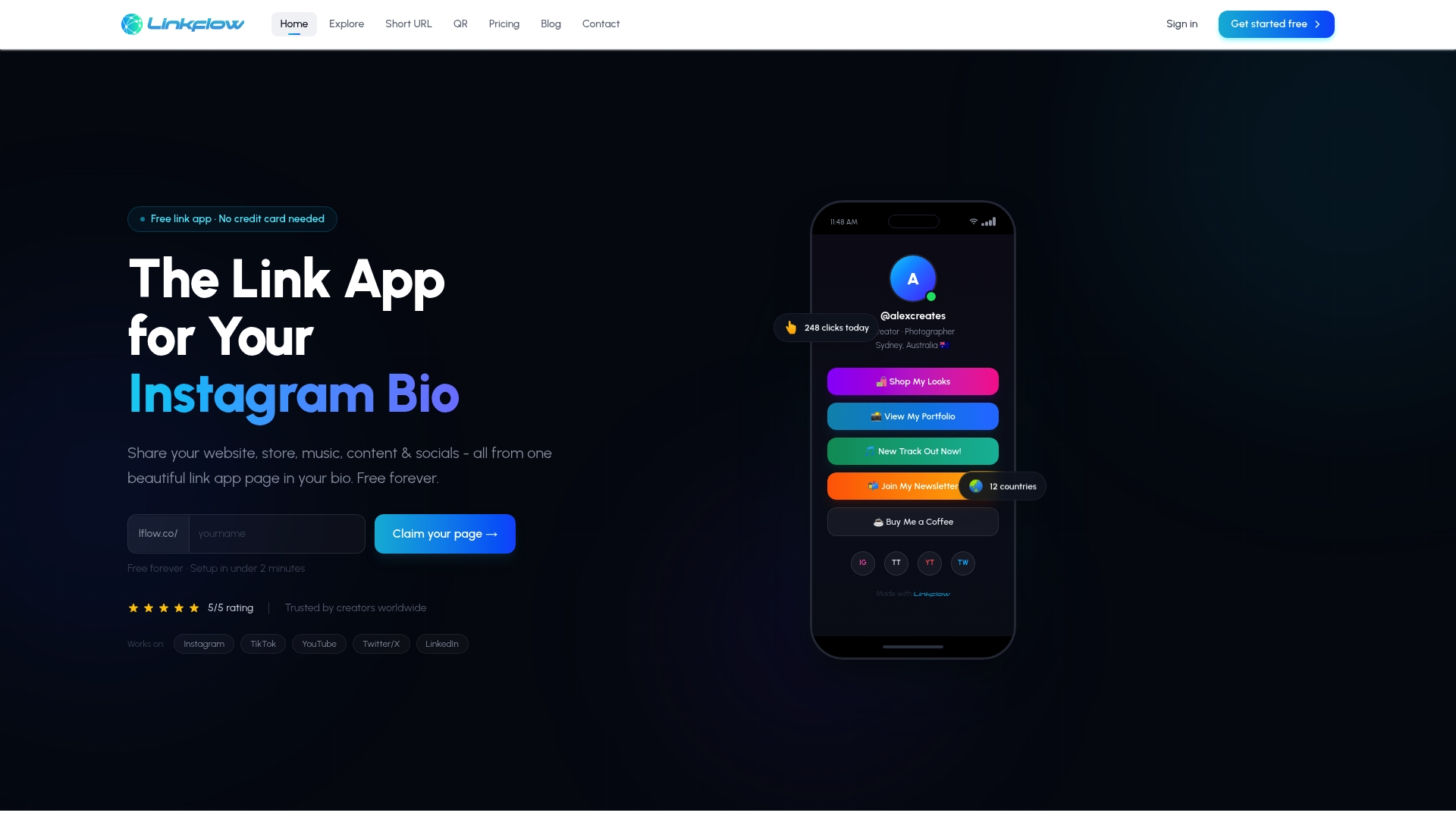
Lflow's free templates are built for exactly this use case. The Creator Ocean template gives musicians a mobile-optimized, modular page that consolidates streaming links, merch, tour dates, and social profiles in one branded URL. Setup takes under two minutes. The Linkflow Signature template suits artists who want a more polished, industry-facing presentation with a clean layout and strong visual hierarchy. Both templates include real-time analytics so you can see what your visitors actually do. For musicians who want to grow online with a link hub, Lflow is the fastest starting point available.
Key takeaways
The most effective musician landing pages combine a singular CTA, high-quality inline audio, mobile-first design, and a clear distinction between fan-facing and industry-facing goals.
| Point | Details |
|---|---|
| One primary CTA | Every page needs one dominant call to action placed above the fold. |
| Audio quality counts | Embed audio at 320 kbps or better to keep visitors on the page. |
| Fan vs. industry pages | Fan pages build community; industry pages pitch with stats and impact tracks. |
| Track order matters | Lead with your highest-impact track, not your newest, on industry portfolios. |
| Mobile is the priority | Test on a real phone and fix load speed before worrying about desktop design. |
FAQ
What should a musician landing page include?
A musician landing page should include a hero image or video, a brief biography under 200 words, 5 to 10 curated tracks, a clear primary CTA, and a mobile-responsive layout. Tour dates, merch links, and social media integrations round out the core elements.
How is a fan page different from an industry portfolio?
Fan pages prioritize merch, community sign-ups, and tour dates, while industry portfolios lead with streaming stats, high-impact tracks, and licensing contact information. The track order and biography focus differ significantly between the two formats.
What design trends define musician landing pages in 2026?
Dark-mode layouts, modular card grids, and data-driven visuals like listener location maps and streaming statistics define current best practices. These features signal professional reach to industry gatekeepers while keeping the page visually engaging for fans.
How long does it take to build a musician landing page?
Specialized platforms like Lflow reduce setup time to under two minutes using pre-built templates. Generic website builders require significantly more time because they lack music-specific features like inline audio and per-visitor analytics.
Why does track order matter on an industry-facing page?
Music supervisors and label representatives decide within seconds whether to keep listening. Placing your highest-impact track first, rather than your newest, maximizes the chance they engage with your best work before moving on.