

Want a styled bio right now? Copy a Unicode-based fancy text style and paste it directly into your bio field. For a font that stays consistent across every device and matches your brand, publish it on a link-in-bio page like Lflow instead of relying on copy-paste text, and always preview your choice on mobile before you save it, since rendering varies by platform.
TL;DR:
- Unicode-based font styles are effective for bios because they copy as real text and work across most platforms, unlike image-based styles.
- Overusing decorative styles like cursive or gothic can hinder readability and accessibility, so limit their use primarily to the name line.
- Always preview styled bios on your mobile device before publishing, because rendering varies and some characters may appear as blank boxes on older devices.
- For consistent branding, site owners should use embedded fonts on dedicated link-in-bio pages rather than relying solely on Unicode styles.
- Combining plain text with one bold or decorative style strikes the best balance between personality and clarity in bios.
Table of Contents
- Ready-to-Copy Font Styles for Your Bio
- How Font Generators Actually Work (Unicode vs. Images)
- Which Font Styles Actually Work Best in a Bio
- Tools That Make This Easier (and When to Use Them)
- How Lflow Handles Font Branding for Creators
- What Actually Matters Here
- Get a Branded Bio Page Set Up Today
- Sources
Ready-to-Copy Font Styles for Your Bio
Every style below is built from standard Unicode characters, which means you highlight it, copy it, and paste it straight into your Instagram, TikTok, or Twitter/X bio. No app download, no font file, no waiting.
- Bold (𝗕𝗢𝗕𝗢) — good for your name or headline; renders on nearly every platform.
- Italic (𝘐𝘵𝘢𝘭𝘪𝘤) — subtle emphasis for a tagline under your name.
- 𝓒𝓾𝓻𝓼𝓲𝓿𝓲 (cursive script) — decorative, best in short bursts like a brand tagline.
- 𝒮𝒸𝓇𝒾𝓅𝓉 (script) — similar to cursive but slightly more compact; works well for one accent line.
- ⓑⓤⓑⓑⓛⓔ (bubble/circled) — playful, ideal for usernames on lifestyle or beauty accounts.
- small caps — reads clean and professional, great for a call-to-action line like "ꜱʜᴏᴘ ᴛʜᴇ ʟɪɴᴋ ʙᴇʟᴏᴡ."""
Monospace— a techy, code-like look that suits developer or gaming bios.- 𝔉𝔯𝔞𝔨𝔵𝔲𝔯/Gothic — heavy and dramatic; best for one word, not a full sentence.
- Fullwidth — wide-spaced characters that stand out in a feed but eat up character count fast.
- S̶t̶r̶i̶k̶e̶t̶h̶r̶o̶u̶g̶h̶ — useful for before/after messaging ("
Old PriceNew Price"). - U̲n̲d̲e̲r̲l̲i̲n̲e̲ — draws the eye to a single word without needing bold.
Pro Tip: Pair one decorative style for your name with plain text for your call-to-action. A bio that's all fancy font, all the time, gets harder to read fast.
Instagram caps bios at 150 characters, and decorative Unicode characters often count the same as plain letters, sometimes more if they combine multiple codepoints. Test your final bio length before publishing, not after.
How Font Generators Actually Work (Unicode vs. Images)
Fancy font generators aren't installing new fonts on your phone. They're mapping regular letters to alternate Unicode characters that already exist in the Unicode standard, the same system that defines every letter, emoji, and symbol your device can render. That's why bold-looking "𝐁" text pastes into Instagram, iMessage, and Google Docs without breaking. It's not a font file. It's a different character entirely, one that happens to look bold.
This is fundamentally different from how web fonts work on a website, where a browser loads an actual font file (like a WOFF2) and applies it to standard text. That approach gives you unlimited style options, but it only works on pages that support font embedding, not inside a social app's bio field. Some tools sidestep Unicode entirely and generate an image or SVG of styled text instead. That looks sharp, but it can't be copied, can't be read by screen readers, and does nothing for search visibility.
- Unicode text: copies as real text, searchable, works in most bios.
- Image-based "fonts": look custom but aren't selectable, copyable, or accessible.
- Avoid stacking excessive combining diacritics ("Zalgo" text) — it can break layout and hurt accessibility for screen reader users.
Always preview a style on your actual phone before publishing. Some Unicode characters render as blank boxes on older devices or specific apps.
Which Font Styles Actually Work Best in a Bio
Readability beats novelty almost every time. A bio stuffed with three different decorative styles looks cluttered and slows down anyone trying to figure out who you are and what you do.
- Name line: one bold or cursive style, never both stacked together.
- Tagline or niche: small caps or plain italic works better here than heavy script, since it's usually the longest line.
- Call-to-action line: keep this plain or bold. This is the line telling people to tap your link, and it needs to be instantly legible.
- Emoji or divider: use sparingly as a visual break between lines, not as decoration on every word.
Instagram's 150-character bio limit forces discipline. A name in fullwidth characters alone can burn 20 to 30 characters before you've written a single word about what you actually do. Plan your three or four lines first in plain text, count the characters, then decide which single line earns the decorative treatment.
One accessibility note worth repeating: pair any decorative font with a plain-text version of your key message somewhere in the bio or your first pinned post. Screen readers often skip or mispronounce heavily stylized Unicode characters, so the person relying on one still needs a way to get your actual message.
Tools That Make This Easier (and When to Use Them)
Three categories cover almost every use case. Simple copy-paste generators convert a single line of text into a chosen style, which works fine when you only want to style your name. Line-by-line bio builders go further, letting you assign a different style to each line and generating a full multi-line bio you paste in one shot, an approach that tools like CopyFont's bio builder are built specifically for. Custom link-in-bio pages are the third category, and they skip Unicode tricks entirely by using real embedded fonts, similar to how CSS @font-face works on any website.
A simple checklist keeps the process fast:
- Type your text into the generator.
- Preview each style option side by side.
- Copy the version you like.
- Paste it into your bio field.
- Verify it renders correctly on your phone, not just your desktop browser.
If you're managing a brand, not just a personal profile, a hosted link-in-bio page solves the consistency problem that copy-paste fonts can't. The font renders the same way for every visitor, on every device, every time.
How Lflow Handles Font Branding for Creators
Copy-paste Unicode styles solve the "right now" problem. They don't solve consistency across devices, and they don't give you data on who's actually clicking through. That's the gap a hosted link-in-bio page closes, and it's where Lflow fits into the picture.
- Onboarding takes under two minutes, start to published page.
- Font and theme customization applies real embedded fonts, not Unicode substitutes, so text renders identically for every visitor.
- Real-time analytics show which links people actually tap, not just impressions.
- Free downloadable QR codes let you take that same branded page offline, onto packaging, business cards, or event signage.
Pro Tip: Use a bold Unicode style in your Instagram bio text itself, then link out to a Lflow page where your full name and tagline use your actual embedded brand font. You get the best of both.
What Actually Matters Here
Most advice on this topic treats font choice like a personality quiz: pick the style that "matches your vibe." That's backwards. The style that matters is the one your audience can read in under two seconds while scrolling, and that means plain or lightly bolded text wins more often than the cursive or gothic options that look impressive in a screenshot.
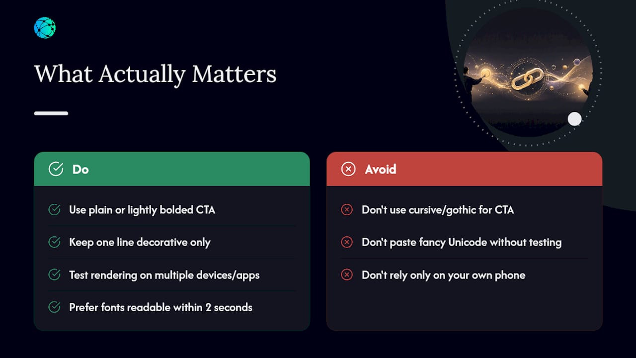
The bigger blind spot is compatibility. Creators paste a fancy Unicode name, it looks perfect on their own phone, and they never check how it renders on an older Android device or inside a comment thread where the app strips styling.
If there's one thing worth prioritizing, it's separating the decorative from the functional. Let one line carry personality. Let the line with your actual call-to-action stay boring and bulletproof. The Unicode standard gives you the styling options; your judgment about restraint is what makes the bio work.
— Axion
Get a Branded Bio Page Set Up Today
Copy-paste fonts get you styled text in thirty seconds, but they max out fast once you need more than a name and a tagline. Lflow gives creators a consistent, on-brand alternative: one page, unlimited links, and a font that renders exactly the same whether someone opens it on an iPhone, a five-year-old Android, or a laptop browser.
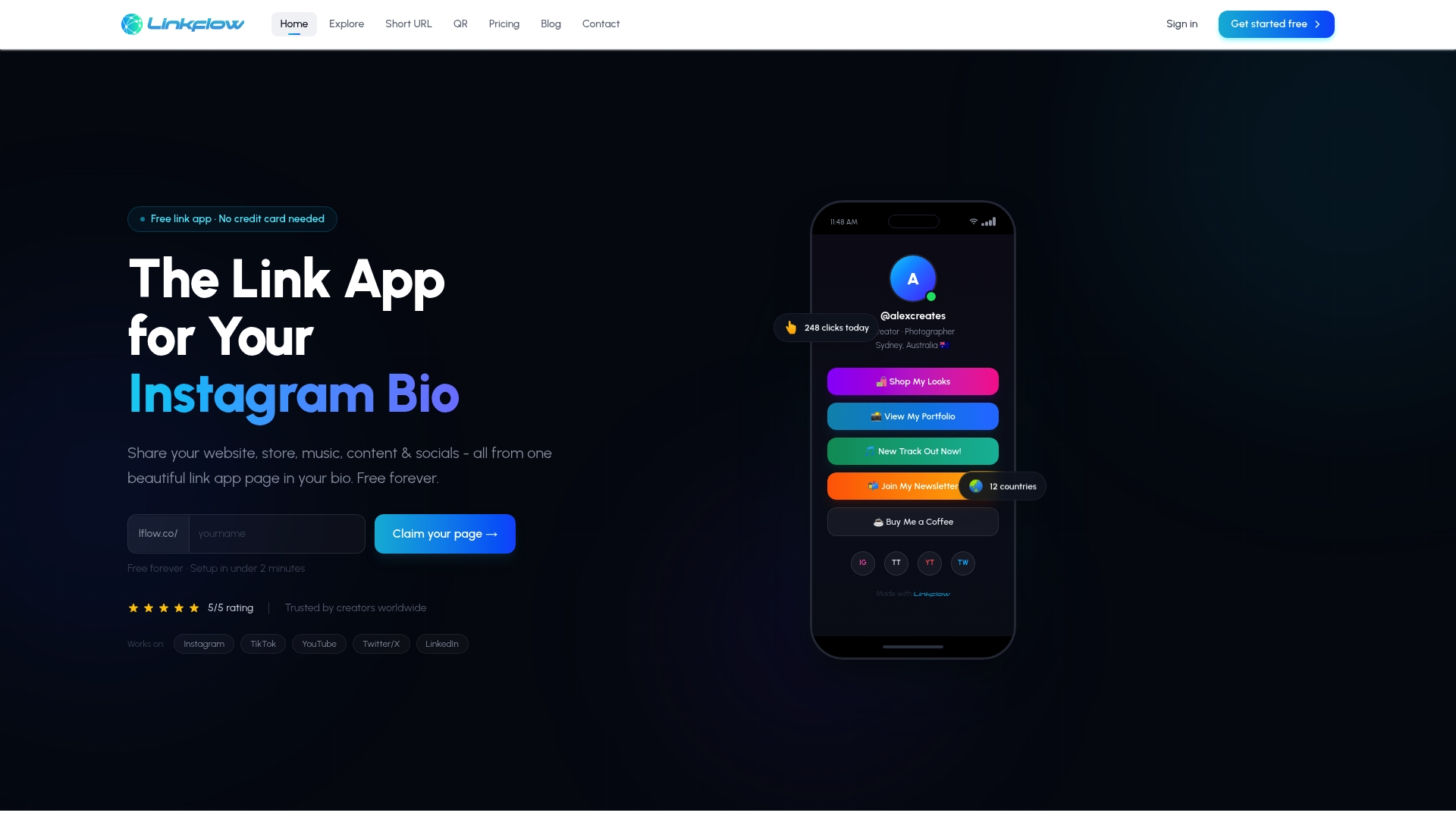
Getting set up takes four steps. Sign up for a free account, choose a template from the design library, customize your fonts and colors to match your feed, then publish. Every published page comes with real-time click analytics and a free downloadable QR code you can drop on packaging, merch, or a storefront sign. If you run workshops or courses, the same setup works well for educator link pages that need to organize multiple resources in one place. Start building your page now and see which links actually earn the clicks.