
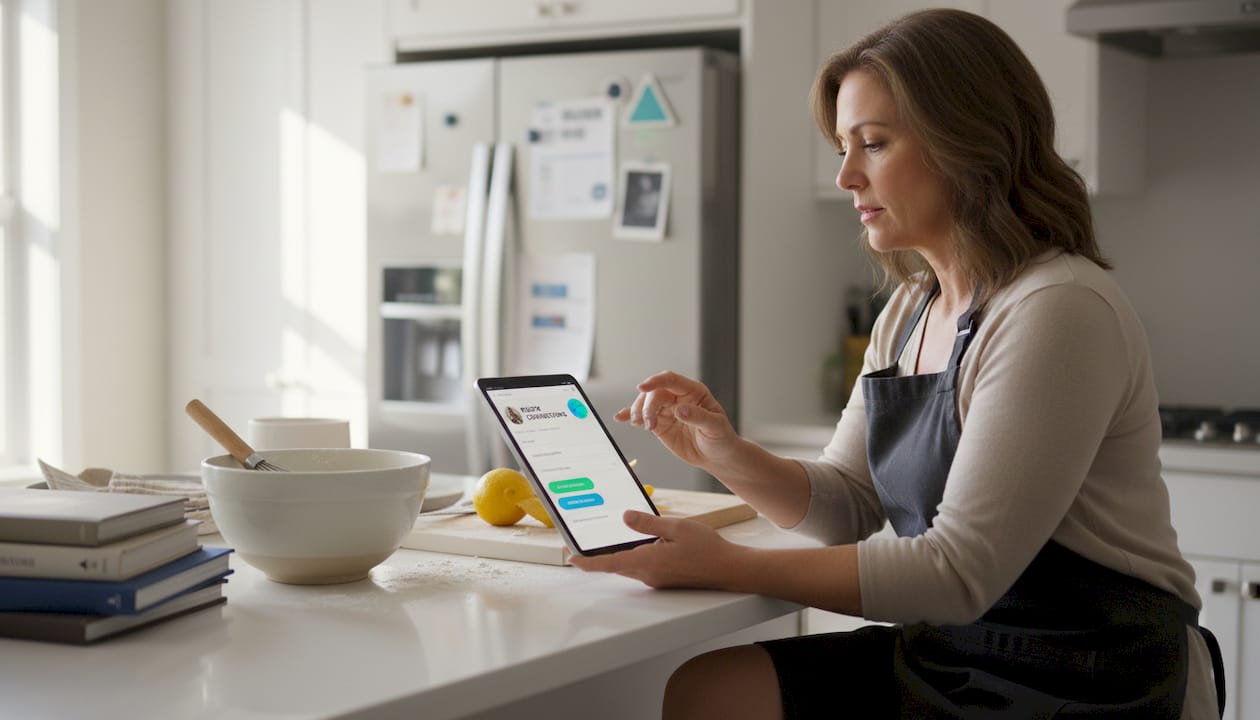
You've got a YouTube channel, an Instagram feed, a podcast, a merch store, and maybe a newsletter. But every platform gives you exactly one link to share with your audience. Most creators throw a generic URL in that slot and call it done, completely missing one of the highest-traffic real estate spots on their entire social presence. A well-built link in bio page can serve as your personal digital headquarters, and the difference between a forgettable one and a conversion-driving one comes down to strategy, branding, and a few lessons from creators who are already doing it right.
Table of Contents
- Why link in bio pages matter for creators
- Real creator and brand link in bio examples
- Top link in bio tools and templates for creators
- How to tailor your link in bio for maximum impact
- What most people miss about link in bio pages
- Explore free templates and tools for your bio link
- Frequently asked questions
Key Takeaways
| Point | Details |
|---|---|
| Branding powers engagement | Effective link in bio pages boost visibility and reinforce your brand identity. |
| Top tools comparison | Platforms like Linktree, Milkshake, and Linkflow offer unique features and templates for creators. |
| Visual consistency matters | Branded visuals and layouts help convert followers into fans and customers. |
| Action drives results | Experimenting with templates and rotating content drives more clicks and conversions. |
Why link in bio pages matter for creators
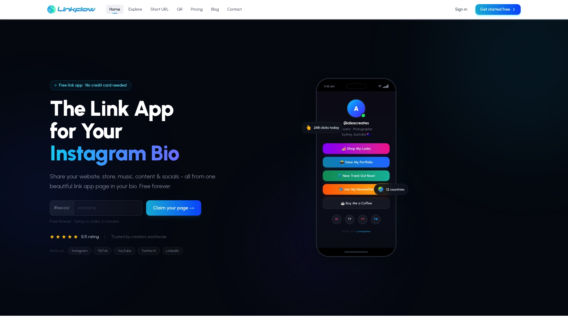
Every platform that limits you to one bio link is, in a way, doing you a favor. It forces you to think strategically about what you want your audience to do next. That single link becomes a funnel entry point, a branding statement, and a navigation hub all at once. When you build it well, it drives real action: newsletter sign-ups, product sales, podcast listens, and event registrations.
The numbers back this up. The link in bio market has exploded, with 31 million Instagram users now using some form of link in bio tool across 62 available platforms. Linktree dominates with a 79.95% market share and 24.7 million users, while competitors like Milkshake (3.7%) and Beacons (2.4%) are carving out loyal audiences with their own design philosophies.
What separates a high-performing bio link page from a cluttered mess? Three things:
- Clarity: Visitors should instantly know what they can do and where to click.
- Branding: The page should feel like a natural extension of your social profile, not a generic placeholder.
- Easy navigation: Keep the most important links above the fold, minimize friction, and make mobile scrolling effortless.
These aren't just aesthetic preferences. They directly affect how long someone stays on your page and whether they click at all. You can build unlimited, branded destinations right away with unlimited bio links that give you control over every design element from day one.
Pro Tip: Don't start from scratch. Using a pre-built template gets you a polished, visually consistent page in minutes, and you can customize it fully once you see what works for your audience.
The most important takeaway here is that your link in bio page is not a temporary fix. It's an asset. Treat it like one.
Real creator and brand link in bio examples
Looking at what successful creators and brands have already built is the fastest way to sharpen your own strategy. Each example below solves a different problem and uses a different design philosophy, but all of them share one trait: intentionality.
Donna Hay: the multi-path hub format
Food media personality Donna Hay uses her bio link as a true content hub. Instead of listing a random assortment of links, her page organizes destinations by audience intent: recipes, books, the online shop, and her TV content all live in clearly labeled sections. Visitors self-select their path based on what they came for, which keeps the bounce rate low and engagement high. This multi-path approach works especially well for creators who serve several different audience segments at once.
Glossier: product showcase with embedded social proof
Glossier integrates product images directly alongside customer reviews and links, effectively turning their bio page into a micro-storefront. Rather than just linking to their website, they recreate a shopping experience inside the page itself. This approach is a masterclass in profile design value, proving that visual layout choices have measurable conversion outcomes. If you sell anything, even digital products, showing the product visually on the page rather than just naming it makes a significant difference.
TED and National Geographic: dynamic content rotation
Both TED and NatGeo use their bio pages as rotating content hubs. When they publish a new talk, article, or documentary, they update the top link immediately. This creates urgency and keeps repeat visitors finding something fresh. For creators who publish consistently, this strategy rewards your loyal audience and signals to new visitors that you're active and producing valuable material.
G Fuel and Steve Madden: image-to-product linking
These brands match their bio page visuals directly to their Instagram grid posts. When a post features a specific product, that exact product is linked at the top of their bio page. It's a seamless handoff between feed content and purchase intent. According to real-world link in bio examples, this grid-matching technique is one of the most effective ways to close the gap between social discovery and purchase. Tools like Linktree (79.95% market share) have popularized this format, but smaller platforms are now offering even more granular control over image layouts.
Here are the key features each of these examples demonstrates:
- Audience segmentation: Organizing links by visitor type or intent
- Visual product integration: Showing images alongside links rather than text alone
- Content freshness: Updating the page regularly to match current campaigns
- Social proof embedding: Using reviews or testimonials directly on the page
- Grid-to-link consistency: Matching post visuals to the bio page for a seamless user journey
"The best link in bio pages don't just list destinations. They tell a story about who you are and what your audience gains by clicking."
Bringing this kind of narrative thinking to your own page is what we cover in our AI bio strategy guide, which walks through how AI tools can help you map content to audience intent automatically. Matching your page's typography to your brand voice is equally important, and brand-matching fonts can transform a generic list into a recognizable brand experience.
Top link in bio tools and templates for creators
Now that you've seen what's possible, the next question is practical: which tool do you use, and how do you pick a template that fits your goals?
Here's a side-by-side comparison of the major players:
| Tool | Market share | Key strength | Free plan | Best for |
|---|---|---|---|---|
| Linktree | 79.95% | Simplicity, widespread recognition | Yes | Beginners and general use |
| Milkshake | 3.7% | Mobile-first card layouts | Yes | Visual-first creators |
| Beacons | 2.4% | Monetization features | Yes | Creators selling digital products |
| Lflow.co | Growing | Branding flexibility, analytics | Yes | Brand-focused creators and influencers |
The link in bio market currently hosts 62 tools competing for the attention of 31 million Instagram users alone. That means you have genuine choices, and the right tool depends on more than just popularity.
Here's how to choose the tool and template that fits your specific situation:
- Define your primary goal. Are you driving traffic to a store, growing your email list, or promoting a specific piece of content? Your goal should determine which links appear first and how the page is structured.
- Match your branding. Look for a tool that lets you set custom colors, fonts, and profile images. Your bio page should look like it belongs to you, not like a default template from 2018. Check out professional branding services if you need help defining your visual identity first.
- Check your conversion features. If you sell products or services, prioritize tools with image blocks, email capture, or embedded video. If you're purely driving content traffic, a clean list layout may serve you better.
- Test before you commit. Most platforms, including Lflow.co, offer free plans with meaningful features. Try bio page templates without a credit card and see which layout earns the most clicks in your first week.
- Compare analytics. You need to know which links your audience actually clicks. Without data, you're guessing. Prioritize tools that show you per-link click rates, device type, and traffic sources.
You can also dive into detailed tool comparisons that break down Lflow.co against Linktree feature by feature, so you know exactly what you're getting before you switch or start fresh.
Pro Tip: Start with a free template that matches your current aesthetic, then swap out one or two elements weekly based on what your analytics tell you. Small, data-informed changes outperform big redesigns almost every time.
How to tailor your link in bio for maximum impact
Picking a tool is just the starting line. What you do with it determines whether your bio link becomes a passive placeholder or an active part of your content strategy.
Here are the core optimization steps that make the biggest difference:
- Define one primary action. Every page should have a single most-important destination, whether that's your store, your latest video, or your newsletter sign-up. Feature it prominently at the top and make the button text action-oriented ("Watch now," "Grab your copy," "Join the list").
- Match your visual identity. Use the same color palette, font style, and tone you use across your other platforms. Consistency signals professionalism and builds trust. Read more about cohesive brand storytelling to understand why this psychological consistency drives click-through rates.
- Integrate analytics from day one. Don't wait until you have thousands of followers to start tracking. Even early data tells you which links resonate and which ones nobody clicks, letting you drop what isn't working before it becomes a habit.
- Enhance your visuals regularly. A static page with the same thumbnail for six months sends a subtle signal that you've stopped paying attention. Use fresh images tied to your current content or campaigns. The guide on visual updates covers exactly how to make image quality work in your favor without needing a professional photographer.
- Use clear, short link labels. "My latest podcast episode" is better than a raw URL or a cryptic "Click here." People decide whether to tap in under a second. Make the label do the work.
- Mobile-test everything. The vast majority of link in bio clicks happen on phones. What looks balanced on a desktop may be cut off or awkwardly spaced on a 6-inch screen.
With 31 million Instagram users relying on these tools, the competition for attention is real. But most pages are still mediocre. A small investment in optimization puts you ahead of the majority without needing a bigger following or a redesign budget.
Pro Tip: Rotate your featured link every time you publish new content. This trains your audience to check your bio regularly and rewards return visitors with something new. Creators who do this consistently report stronger repeat click rates than those who set their page once and forget it.
What most people miss about link in bio pages
Here's the honest take most articles won't give you: creators treat their bio link like a filing cabinet and wonder why nobody opens it.
The instinct is understandable. You have a lot of links. You want them all in one place. So you pile them in, label them generically, and move on. But that thinking treats your bio page as a logistical solution rather than a brand touchpoint. And that's where most creators leave real engagement on the table.
Think about what happens when someone lands on your bio page for the first time. They likely came from a single post or reel they found interesting. They're curious but not committed. What they see in the next few seconds either deepens that curiosity or ends it. A page with eight identical gray buttons labeled "Website," "YouTube," "Store," "Podcast," and "Newsletter" gives them no reason to feel anything. A page that mirrors your brand's color story, uses brand-first thinking in its typography, and features a single bold call to action tells a very different story about who you are.
The best link in bio pages function as landing pages, not directories. They have a visual hierarchy, a clear narrative, and a primary destination that reflects your current goals. The secondary and tertiary links support that primary destination rather than competing with it.
Content rotation is the other piece most creators ignore. Your bio page should change when your content changes. If you launched a new product three weeks ago but your bio page still promotes something from last quarter, you're wasting the traffic your current content is driving. The creators getting the most out of this tool treat it like an active part of their publishing workflow, not a one-time setup task.
The real opportunity is this: your bio link is often the first place a potential follower, brand partner, or customer goes to understand what you're about. Give it the same attention you give your best-performing post.
Explore free templates and tools for your bio link
Ready to put these ideas into practice? Lflow.co makes it genuinely fast to go from zero to a polished, branded bio link page, with setup taking under two minutes and no design experience required.
Explore the full library of bio templates built specifically for creators, with options spanning clean minimal layouts, bold visual grids, and content-heavy hubs. Every template is fully customizable: change colors, fonts, and images to match your brand exactly. And with unlimited free bio links, you're not locked into a limited link count even on the free plan. Built-in analytics show you what's working in real time, and the free QR code download gives you a way to promote your page offline, at events, on packaging, or in print materials.
Frequently asked questions
What makes a link in bio page effective?
A successful link in bio page is visually consistent with your brand, easy to navigate on mobile, and organized around one primary call to action, with secondary links that support rather than compete with it. Clarity, branding, and navigation are the three pillars that separate high-performing pages from generic ones.
Which platforms offer the best link in bio tools?
Linktree (79.95% market share), Milkshake, Beacons, and Lflow.co are the leading platforms, each with distinct strengths in design flexibility, monetization, and analytics depth. The best choice depends on your specific goals, such as branding, selling, or content promotion.
How can I customize my link in bio page for my brand?
Start with a template that matches your visual style, then customize colors, fonts, and imagery to align with your existing brand identity, and update your featured links every time you publish new content. Using templates for rapid setup is the most efficient way to maintain visual consistency without starting from scratch each time.
Do link in bio tools support analytics?
Most major platforms, including Lflow.co, offer real-time analytics for tracking clicks and audience behavior, which lets you see exactly which links perform and make informed decisions about what to feature or remove.